How Color Temperature Affects Mixing in Painting Techniques
What is Color Temperature in Art and Painting?
Color temperature refers to the warmth or coolness of a color, which can significantly impact how colors interact in a painting. Warmer colors, like reds and yellows, tend to advance toward the viewer, while cooler colors, like blues and greens, recede. This concept is not just about aesthetics; it plays a vital role in how artists mix and layer colors for desired effects.
Color is the keyboard, the eyes are the harmonies, the soul is the piano with many strings.
Understanding color temperature helps artists create depth and dimension in their work. For instance, when mixing colors, knowing that warm and cool tones can enhance or diminish each other’s vibrancy allows for more intentional choices. This knowledge can transform a flat painting into a dynamic piece that draws the eye.
Additionally, color temperature can evoke different emotions and moods. An artist might choose a warm palette to create a cozy, inviting atmosphere or use cool tones for a serene, tranquil effect. This emotional impact makes it essential to grasp how color temperature works in painting.
The Science Behind Color Mixing and Temperature
At its core, color mixing involves both subtractive and additive processes. Subtractive mixing, often used in painting, combines pigments to create new colors by absorbing certain wavelengths of light. Knowing whether a color is warm or cool can influence how these colors blend together, affecting the final outcome.
For example, mixing a warm red with a cool blue can produce a muted purple rather than a vibrant one. This happens because the coolness of the blue can temper the warmth of the red, resulting in a different hue than if both were warm. Understanding these nuances can help artists achieve more precise results in their color mixing.
Understanding Color Temperature
Color temperature influences how colors interact, creating depth, emotion, and vibrancy in paintings.
Moreover, the quality of light affects how colors appear. A bright, warm light can make colors look more vibrant, while a cool, dim light might dull them. Artists often adjust their mixing techniques based on the lighting conditions to maintain the integrity of their colors.
How Color Temperature Affects Layering Techniques
Layering is a common technique in painting where colors are applied on top of one another to create depth. The temperature of the colors used in each layer can significantly affect the overall feel of the painting. For instance, a base layer of warm tones can create a glowing effect when topped with cooler colors.
The primary colors are those which cannot be produced by mixing other colors together. They are the foundation of all colors.
When layering, artists often start with warmer colors at the bottom to build a sense of warmth and vibrancy. As they add layers on top, they might introduce cooler shades to provide contrast and balance. This approach can enhance the visual appeal and complexity of the artwork.
Additionally, understanding color temperature allows artists to achieve translucency in their layers. A cool glaze over a warm base can create a luminous effect, making the painting feel more alive. This interplay of temperatures is crucial for artists looking to elevate their work.
Using Color Temperature to Create Depth and Perspective
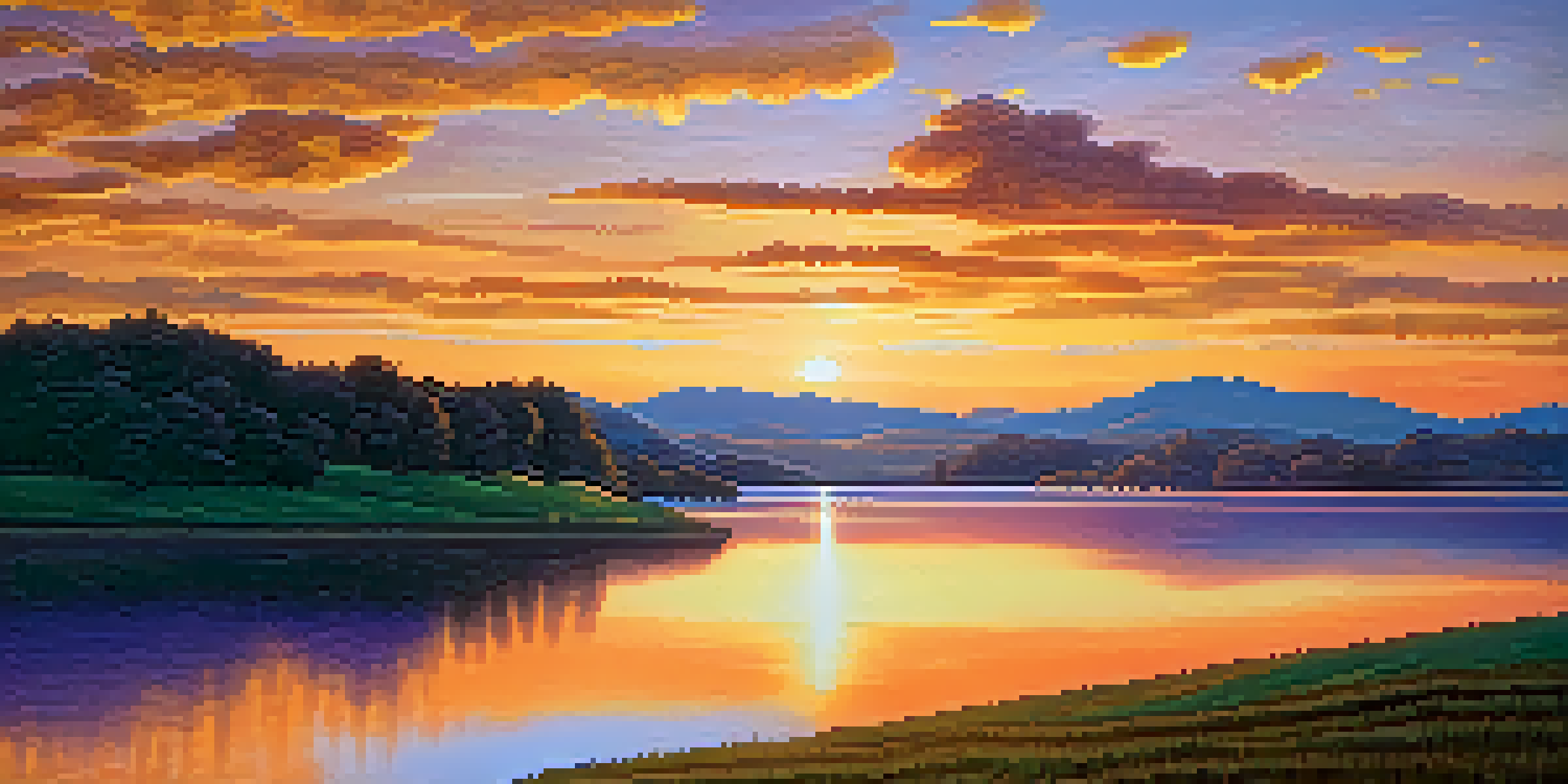
Artists can manipulate color temperature to create an illusion of depth and perspective in their compositions. Warmer colors tend to appear closer to the viewer, while cooler colors recede into the background. This technique can make a flat painting feel three-dimensional.
For instance, in landscape painting, an artist might use warm greens and yellows in the foreground and cooler blues and purples in the background. This not only establishes a sense of distance but also guides the viewer’s eye throughout the piece. Such considerations are essential for creating realistic and engaging scenes.
Impact on Layering Techniques
The temperature of colors in layering can enhance the visual appeal and complexity of a painting.
Moreover, artists can use this technique strategically to emphasize focal points. By employing warmer tones in areas where they want to draw attention, they can create a natural spotlight effect. This approach enhances the storytelling aspect of the artwork.
The Role of Color Temperature in Emotional Expression
Color temperature plays a crucial role in conveying emotions through art. Warm colors often evoke feelings of happiness, energy, and passion, while cool colors can evoke calmness, sadness, or introspection. This emotional language is vital for artists to master in order to communicate effectively with their audience.
For instance, a painting dominated by reds and oranges might convey excitement or warmth, while one filled with blues and greens could suggest tranquility or melancholy. By understanding and manipulating color temperature, artists can guide the emotional response of the viewer.
Additionally, juxtaposing warm and cool colors can create tension or harmony in a painting. This contrast not only enhances visual interest but also deepens the emotional impact. Effective use of color temperature can elevate the narrative quality of a piece, making it resonate more with viewers.
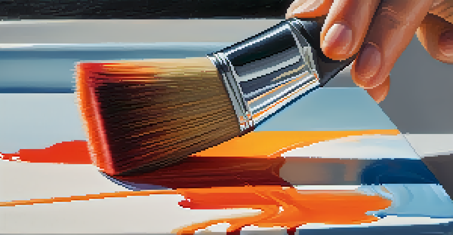
Practical Tips for Mixing Colors with Temperature in Mind
When mixing colors, start by categorizing them into warm and cool groups. This simple exercise can help you envision how they will interact. For instance, mixing a warm yellow with a cool blue can yield a muted green, while combining two warm colors will produce a more vibrant outcome.
Experimentation is key in understanding how color temperature affects your mixing. Create a color wheel or swatch chart using different temperature combinations to see firsthand how they blend. This hands-on approach can deepen your understanding and enhance your skills.
Emotional Expression through Color
Manipulating warm and cool colors allows artists to convey emotions and create engaging narratives in their work.
Lastly, always consider the lighting conditions in your workspace. Natural light can change the appearance of colors, so make adjustments as necessary. Keeping a consistent light source can help you maintain clarity in your mixing process.
Conclusion: Mastering Color Temperature for Better Painting
Mastering color temperature is an essential skill for any painter looking to enhance their work. By understanding how warm and cool colors interact, you can create depth, emotion, and vibrancy in your paintings. This knowledge empowers you to make informed decisions about your color choices.
As you practice mixing and layering with color temperature in mind, you'll find that your paintings can evoke stronger emotional responses and visual interest. Each brushstroke becomes intentional, and your artistic voice becomes clearer. Remember, art is as much about conveying feelings as it is about technique.
Incorporating color temperature into your painting practice will not only improve your technical skills but also enrich your creative expression. So, grab your brushes and start experimenting with the beautiful world of color temperature!