Analyzing Famous Paintings: Color Relationships and Impact

Understanding Color Theory in Art
Color theory is the foundation of how artists use color to convey meaning. It involves understanding the color wheel, which categorizes colors into primary, secondary, and tertiary groups. Artists use this wheel to create harmonious color combinations or stark contrasts that can evoke various emotions.
Color is the keyboard, the eye is the harmonica. The artist is the composer.
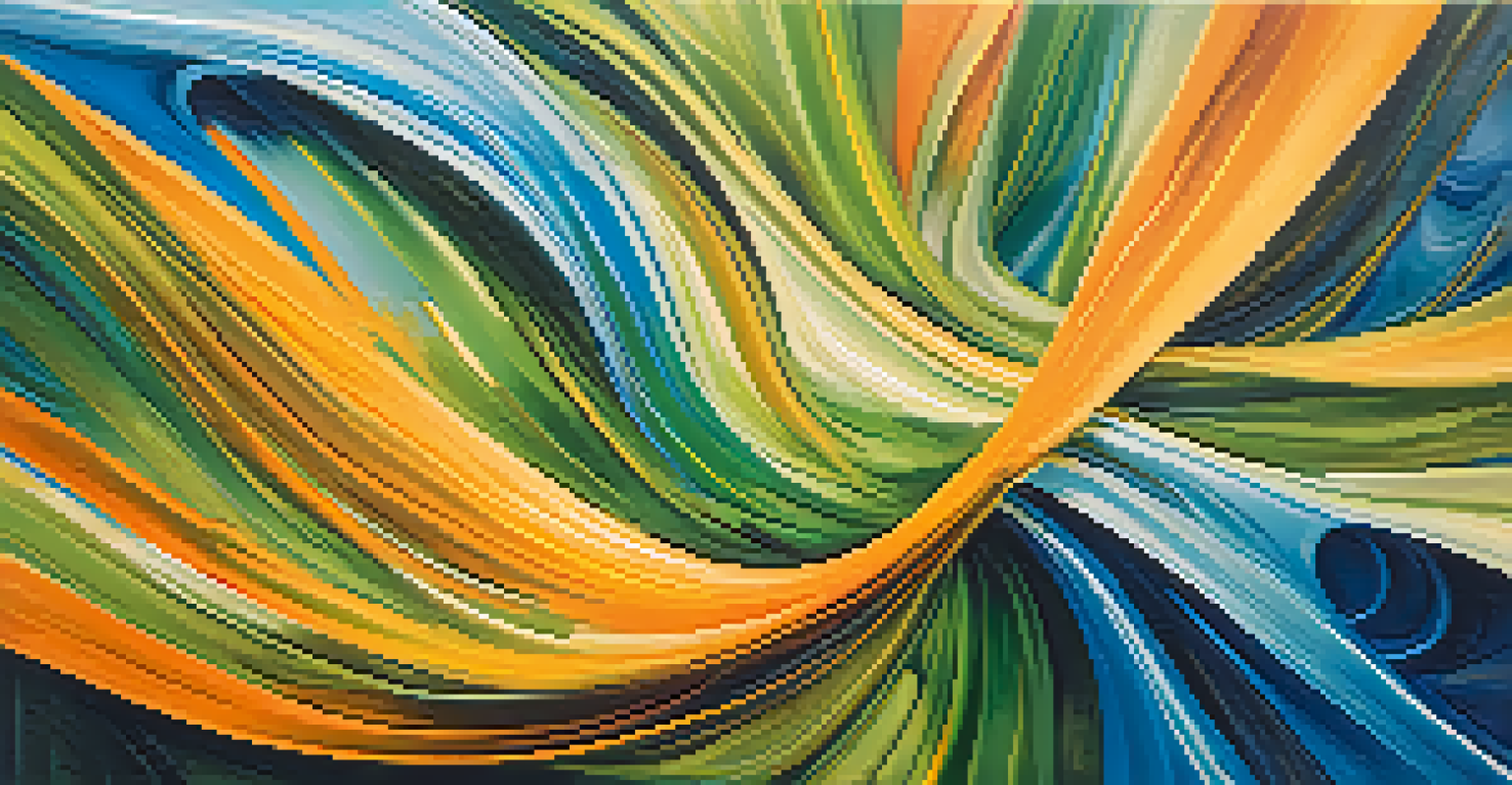
For example, complementary colors—those opposite each other on the color wheel—create a vibrant look when paired. Think of how the fiery red and cool green in Van Gogh's 'The Night Café' pull the viewer’s attention and create a sense of tension. This deliberate choice speaks volumes about the atmosphere he aimed to portray.
Moreover, understanding color temperature, like warm hues (reds, yellows) versus cool hues (blues, greens), adds another layer to an artwork's emotional impact. Each color can be seen as a character in a story, influencing how the viewer feels and interacts with the piece.
The Role of Color in Emotion and Mood
Color can significantly influence our emotions, and artists have mastered this technique. Take Picasso's 'Blue Period,' where the use of somber blues conveys feelings of sadness and isolation. The cold palette echoes the experiences of loss and despair, pulling viewers into the artist's emotional world.
In contrast, warm colors can evoke happiness and energy. Think about Claude Monet’s 'Sunrise,' where the vibrant oranges and yellows bring forth feelings of warmth and optimism. This is a reminder of how color choice can transform not just the artwork, but the viewer's experience.
Color's Emotional Influence in Art
Artists use color strategically to evoke emotions, as seen in Picasso's 'Blue Period' which conveys sadness through somber blues.
Ultimately, artists wield color like a magician, crafting various moods and emotional narratives. The subtleties in color relationships can either uplift us or reflect deeper, more complex human experiences.
Analyzing Color Relationships in Iconic Works
When we analyze famous paintings, we can discover how color relationships enhance the overall composition. Take Edvard Munch's 'The Scream,' where the swirling oranges and blues work together to create a feeling of chaos and anxiety. The contrasting colors reflect the inner turmoil of the figure, making the viewer feel that tension.
Colors are the smiles of nature.
Similarly, in 'Starry Night,' Van Gogh uses contrasting colors to create depth and movement in the sky. The intense yellows of the stars against the deep blues of the night sky create a dreamlike quality that draws the viewer into a cosmic dance. This interplay of colors invites us to experience a blend of tranquility and excitement.
Therefore, examining these relationships helps us appreciate the skill behind each brushstroke. It reveals the thought process of artists as they strategically choose colors to not only beautify but to communicate complex emotions.
The Impact of Cultural Context on Color Use
Cultural context plays a crucial role in how colors are perceived and used in art. For instance, in many Eastern cultures, red symbolizes luck and prosperity, while in Western cultures, it often signifies danger or urgency. Artists often draw from their cultural backgrounds to inject layers of meaning into their work.
Consider the use of colors in Frida Kahlo's self-portraits, where vibrant colors are steeped in Mexican heritage. The bold reds, greens, and yellows reflect her cultural identity and personal struggles, making her work resonate deeply with viewers from similar backgrounds.
Cultural Context Shapes Color Meaning
Cultural backgrounds significantly influence color perception, with artists like Frida Kahlo incorporating vibrant hues that reflect their heritage.
Thus, understanding the cultural significance of colors can enhance our appreciation of a painting. It opens a dialogue between the artist's intentions and the audience's interpretations, enriching the experience of art.
Color and Composition: Creating Visual Harmony
Composition in art refers to how elements are arranged within a piece, and color plays a pivotal role in achieving visual harmony. Artists often use color to guide the viewer's eye and create a sense of balance. For instance, in Gustav Klimt’s 'The Kiss,' the golden hues envelop the figures, creating a sense of intimacy and unity.
The strategic placement of color can also lead to the focal point of a painting. In 'The Girl with a Pearl Earring' by Vermeer, the striking blue of the girl’s turban draws our gaze immediately, allowing the pearl earring to become a subtle yet important detail.
This connection between color and composition reveals the artist's intention to create a visual narrative. The way colors are layered and arranged can transform a chaotic scene into a harmonious one, enhancing the overall impact of the artwork.
The Evolution of Color Use in Art History
Throughout art history, the use of color has evolved significantly, influenced by cultural shifts, technological advancements, and artistic movements. The Renaissance introduced a more naturalistic approach, with artists like Leonardo da Vinci employing chiaroscuro to create depth and volume using color.
In contrast, the Impressionists pushed boundaries by experimenting with light and color, often using loose brushstrokes and vibrant palettes to capture fleeting moments. Monet’s 'Impression, Sunrise' exemplifies this shift, where color is used not just to depict reality but to express the essence of a scene.
Color Relationships Enhance Composition
By analyzing iconic works, we can see how color relationships—like those in Van Gogh's 'Starry Night'—create depth and emotional engagement.
As we move into modern and contemporary art, color continues to play a vital role. Artists break the traditional rules, using color in abstract ways to provoke thought and emotion. This evolution highlights how color remains a dynamic element within the ever-changing landscape of art.
The Personal Connection: Color and Viewer Experience
The beauty of art lies not just in the artist's choices, but in how viewers interpret those choices. Each person brings their own experiences and emotions to a painting, making the interaction unique. For instance, someone might find comfort in the soft blues of a serene landscape, while another may feel a sense of melancholy.
This personal connection to color can transform the experience of viewing art. When visiting a gallery, we may be drawn to certain pieces based on their color schemes, which resonate with our current mood or memories. It’s like an unspoken dialogue between the artwork and our own lives.
Therefore, understanding color relationships not only enhances our appreciation of art but also invites us to reflect on our emotional responses. It reminds us that art is a living conversation, continually evolving with each new viewer.