Creating Mood Through Color: A Guide for Aspiring Artists
Understanding the Basics of Color Theory for Artists
Color theory is the foundation of any artist's palette. It explains how colors interact, complement, and contrast with each other. By understanding the color wheel, you can make informed decisions about which shades to use in your artwork.
Color is the keyboard, the eyes are the harmonies, the soul is the piano with many strings.
Primary colors—red, blue, and yellow—are the building blocks of all other colors. When mixed, they create secondary colors, like purple, green, and orange. This knowledge helps you create a harmonious composition that resonates with viewers.
Additionally, understanding warm and cool colors can drastically change the mood of your artwork. Warm colors like reds and yellows create feelings of excitement, while cool colors like blues and greens evoke calmness and serenity.
The Emotional Impact of Colors in Art
Colors carry deep psychological meanings and can evoke various emotions. For instance, red is often associated with passion or anger, while blue can convey tranquility or sadness. Recognizing these associations can help you choose colors that effectively communicate your intended message.
Consider how artists like Van Gogh used color to express their feelings. His vibrant yellows and swirling blues in 'Starry Night' not only create a stunning visual but also convey a sense of turmoil and beauty simultaneously. This shows the power of color in storytelling.
Color Theory Basics for Artists
Understanding the color wheel and the interaction of primary, secondary, warm, and cool colors is essential for creating harmonious artwork.
As you create your artwork, think about the emotions you want to evoke in your audience. By selecting a color palette that aligns with your theme, you can guide viewers’ emotional responses and deepen their connection to your art.
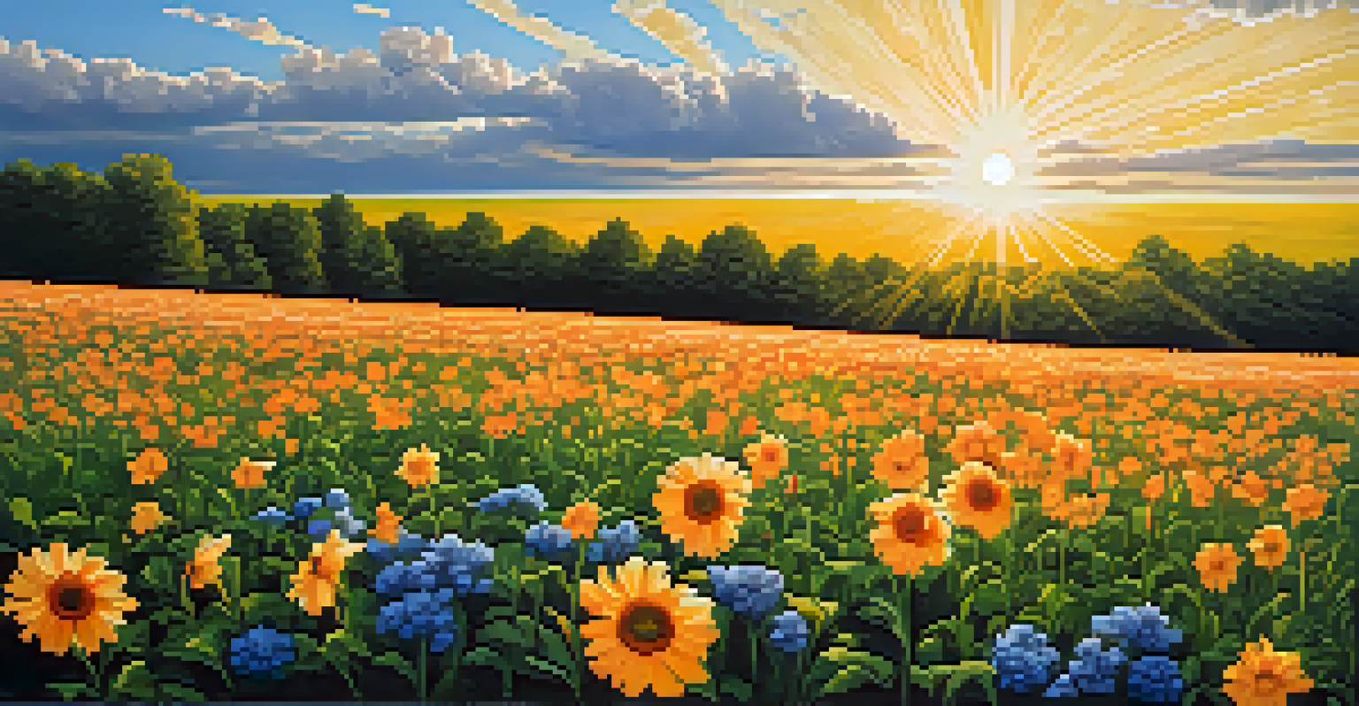
Using Warm Colors to Create Energy and Excitement
Warm colors—such as red, orange, and yellow—are perfect for conveying energy and enthusiasm. They draw attention and stimulate emotions, making them ideal for artwork that aims to inspire action or joy. Think of a sunset painting that bursts with vibrant oranges and yellows; it radiates warmth and excitement.
Colors are the smiles of nature.
When using warm colors, balance is key. Too much can overwhelm viewers, while just the right amount can create a dynamic focal point. For instance, a burst of red in a predominantly blue painting can create an energetic contrast that captures the eye.
Experiment with warm color combinations to see how they influence the mood of your piece. You might find that a splash of orange can invigorate a dull composition, transforming it into something lively and engaging.
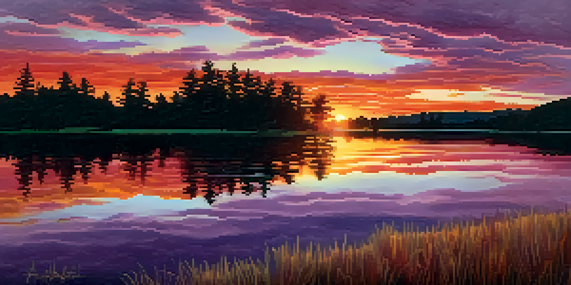
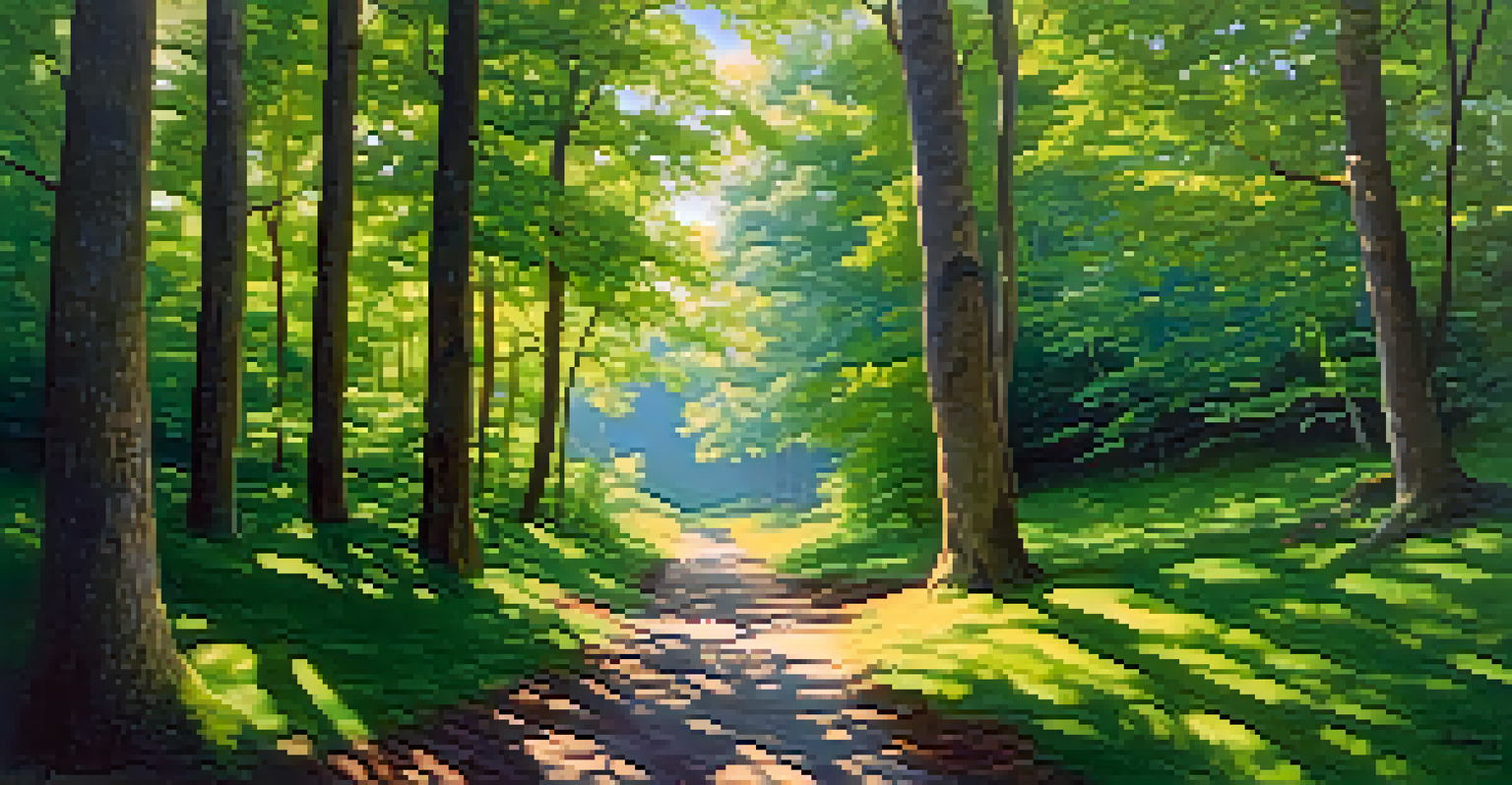
Cool Colors: Calming Effects and Serene Atmospheres
Cool colors—like blue, green, and purple—evoke feelings of calmness and tranquility. They are often used in landscapes or scenes meant to convey peace, such as serene waters or lush forests. A painting dominated by cool colors can transport the viewer to a place of relaxation.
These colors can also create depth and distance in your artwork. For example, using lighter shades of blue in the background can give the illusion of a vast sky, drawing the viewer's eye deeper into the scene. This technique enhances the overall mood of your piece.
Emotional Impact of Colors
Colors evoke specific emotions and can significantly influence the viewer's perception and connection to the artwork.
When incorporating cool colors, consider how you can mix them with warm colors for contrast. A scene of a tranquil lake at sunset, with warm hues reflecting off the water, can create a beautiful balance between serenity and warmth.
The Role of Contrast in Mood Creation
Contrast plays a crucial role in creating mood and visual interest in art. By juxtaposing different colors, you can enhance emotions and draw attention to specific areas of your composition. For example, a bright yellow sun against a deep blue sky creates a striking visual impact.
Using complementary colors—those opposite each other on the color wheel—can create a sense of vibrancy. When placed side by side, these colors intensify each other, adding drama and excitement to your artwork. Think of how a brilliant orange flower stands out against a lush green background.
However, too much contrast can be jarring. Aim for a thoughtful balance that enhances your message without overwhelming your audience. Subtle contrasts can still provide depth while maintaining a harmonious overall feel.
Creating a Color Palette That Reflects Your Style
Developing a unique color palette is essential for expressing your artistic voice. Start by experimenting with different combinations of colors to see what resonates with you. Consider the emotions you want to convey and select shades that align with that vision.
Look at the works of artists you admire and analyze their color choices. You might notice patterns or themes in their palettes that inspire your own. Try creating a mood board with colors that evoke feelings you want to capture in your art.
Creating a Unique Color Palette
Developing a consistent and personal color palette helps to express your artistic voice and makes your artwork more recognizable.
Once you've established a palette, stick with it as you create your pieces. This consistency will help to strengthen your style and make your artwork recognizable to others. Over time, you'll refine your palette and develop a signature look.
Practical Tips for Implementing Mood Through Color
To effectively implement mood through color in your artwork, start with a clear vision of the emotions you want to express. Sketch out your ideas and select a color palette that aligns with that vision. This will serve as your foundation as you begin to paint.
Don't hesitate to experiment! Mixing colors can lead to unexpected results, so embrace the process. You might discover new shades and combinations that evoke feelings you hadn’t anticipated, enriching your artistic expression.
Lastly, step back and evaluate your work periodically. Consider how the colors interact and whether they convey the mood you intended. This reflective practice can help you grow as an artist and refine your ability to evoke emotions through color.