Emotional Responses to Color: Case Studies in Art

Understanding Color Psychology in Art
Color psychology explores how different colors influence human emotions and behaviors. Artists have long used color to evoke feelings, creating a powerful connection with their audience. For example, warm colors like red and orange can elicit feelings of warmth and excitement, while cooler tones like blue and green often inspire calm or sadness.
Color is the keyboard, the eyes are the harmonies, the soul is the piano with many strings.
This psychological effect is not just theoretical; it can be observed in various art movements. The Impressionists, for instance, utilized vibrant palettes to convey fleeting emotions, showcasing how color shapes our perception of a scene. Understanding these principles helps both artists and viewers appreciate the deeper emotional layers within artworks.
As we delve into specific case studies, we will see firsthand how color choices impact viewer reactions and interpretations. These insights highlight the profound relationship between color, emotion, and artistic expression.
Case Study: Van Gogh's Emotional Color Schemes
Vincent van Gogh is a prime example of an artist who masterfully manipulated color to express emotion. In works like 'Starry Night,' the swirling blues and yellows reflect his turbulent state of mind and evoke a sense of awe and melancholy. The contrasting colors create a dynamic tension, drawing viewers into his emotional landscape.

Van Gogh believed that color could convey feelings more effectively than words. By using bold, saturated hues, he communicated his inner turmoil and passion, allowing audiences to experience his emotions directly. This approach highlights how color can transcend language and connect people on a deeper level.
Color Evokes Emotion in Art
Different colors can significantly influence human emotions, with artists using them to create powerful connections with their audience.
The impact of Van Gogh's color choices continues to resonate today, influencing both artists and psychologists. His ability to evoke emotion through color serves as a poignant reminder of how powerful a simple palette can be in storytelling.
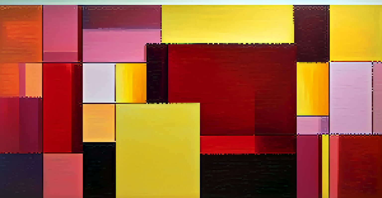
The Role of Color in Abstract Art
Abstract art often relies heavily on color to convey emotions, as it typically lacks recognizable subjects. Artists like Mark Rothko used large fields of color to create an immersive experience that invites personal interpretation. His famous color blocks aim to evoke deep emotional responses, allowing viewers to engage with their feelings in a unique way.
Colors are the smiles of nature.
For Rothko, color was not just a visual element; it was a means of communication. The emotional weight of his paintings can vary greatly depending on the colors used, with darker tones often associated with sadness and lighter hues conveying joy. This exploration of color as an emotional language showcases the depth of abstraction in art.
By focusing on color alone, abstract artists challenge traditional notions of representation and invite viewers to explore their own emotional landscapes. This approach emphasizes the idea that art can be a deeply personal experience, shaped by individual perceptions of color.
Color in Feminist Art: A Case Study of Judy Chicago
Judy Chicago's work, particularly 'The Dinner Party,' utilizes color to challenge societal norms and evoke feminist ideals. The vibrant colors of the plates and table settings symbolize the diverse experiences of women throughout history. By employing a rich color palette, Chicago emphasizes the importance of these narratives and the emotional weight they carry.
In her art, color serves as both a tool for celebration and a means of critique. The interplay of colors not only attracts attention but also encourages dialogue about women's roles and contributions. This strategic use of color highlights the emotional resonance behind feminist messages in contemporary art.
Cultural Context Shapes Color Meaning
Color perception varies across cultures, affecting how art is interpreted and the emotional responses it elicits from viewers.
Chicago's case illustrates how color can amplify the impact of an artistic statement, transforming a simple dinner setting into a powerful commentary on gender equality. Her work demonstrates that color, when used intentionally, can evoke strong emotional responses and provoke thought.
Exploring Cultural Differences in Color Perception
Color perception can vary significantly across cultures, influencing emotional responses to art. For instance, while white is often associated with purity in Western cultures, it may symbolize mourning in some Eastern cultures. This cultural context plays a crucial role in how art is interpreted and felt by different audiences.
Artists who understand these cultural nuances can create works that resonate on multiple levels. When exhibiting art internationally, considering local color associations can enhance the emotional impact of the piece. This cross-cultural understanding allows for richer experiences and connections between the artwork and its viewers.
By exploring these differences, we can appreciate the diverse emotional landscapes shaped by color. This awareness also encourages artists to think critically about their color choices and the potential implications for their audience.
Colors of Nature: Art Inspired by Landscapes
Nature has long been a source of inspiration for artists, with color playing a vital role in conveying the beauty and emotion of landscapes. The lush greens of a forest or the warm oranges of a sunset can evoke feelings of tranquility, nostalgia, or even longing. By capturing these colors in their work, artists create a bridge between the viewer and the natural world.
Consider the works of artists like Claude Monet, who captured the changing light and color of landscapes with remarkable sensitivity. His use of color not only depicts the scene but also evokes the emotions associated with these fleeting moments in nature. This connection enhances our appreciation for both the artwork and the environment.
Nature Inspires Emotional Color Use
Artists draw from the colors of nature to convey beauty and emotion, enhancing connections between the artwork and the viewer.
Art inspired by nature invites viewers to reflect on their own emotional responses to the world around them. The colors found in these pieces remind us of the beauty and complexity of our surroundings, deepening our connection to both art and nature.
The Future of Color in Art and Emotional Expression
As we look to the future, the role of color in art will continue to evolve, influenced by technology and societal shifts. Artists are experimenting with new mediums, such as digital art, where color can be manipulated in unprecedented ways. This opens up exciting possibilities for emotional expression, allowing for more immersive experiences.
Moreover, as global interconnectedness grows, artists can draw inspiration from diverse color palettes and cultural meanings. This blending of influences can lead to innovative approaches to emotional storytelling through color. By embracing these changes, artists can create work that resonates with a broader audience.
Ultimately, the exploration of color and emotion in art remains a dynamic field. By understanding past and present case studies, we can anticipate how future artists will harness the power of color to convey their emotions and connect with viewers in profound ways.