The Relationship Between Color and Texture in Art Composition
Understanding Color in Art Composition
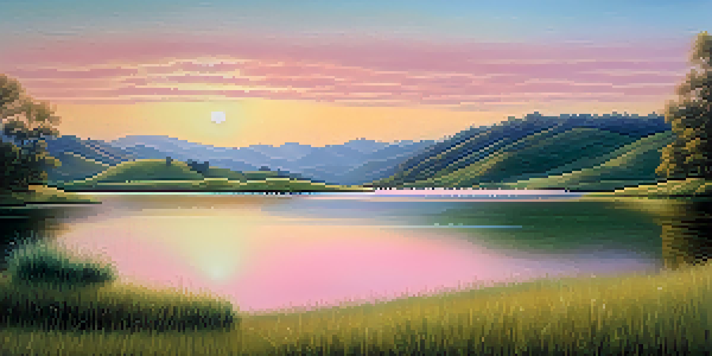
Color is one of the most powerful tools in an artist's palette. It can evoke emotions, set the mood, and guide the viewer's eye through the artwork. For instance, warm colors like reds and yellows can create a sense of energy and excitement, while cool colors such as blues and greens often convey calmness and serenity.
Color is the keyboard, the eyes are the harmonies, the soul is the piano with many strings.
Artists often consider color theory, which explores how colors interact with each other. Complementary colors, which are opposite on the color wheel, can create vibrant contrasts that draw attention, while analogous colors, which sit next to each other, provide harmony. This strategic use of color can significantly impact the overall composition.
Ultimately, the choice of color can tell a story or convey a message in art. Whether it’s the boldness of a bright red or the subtleness of a pastel shade, color is an essential element that shapes the viewer's perception and experience.
The Role of Texture in Art
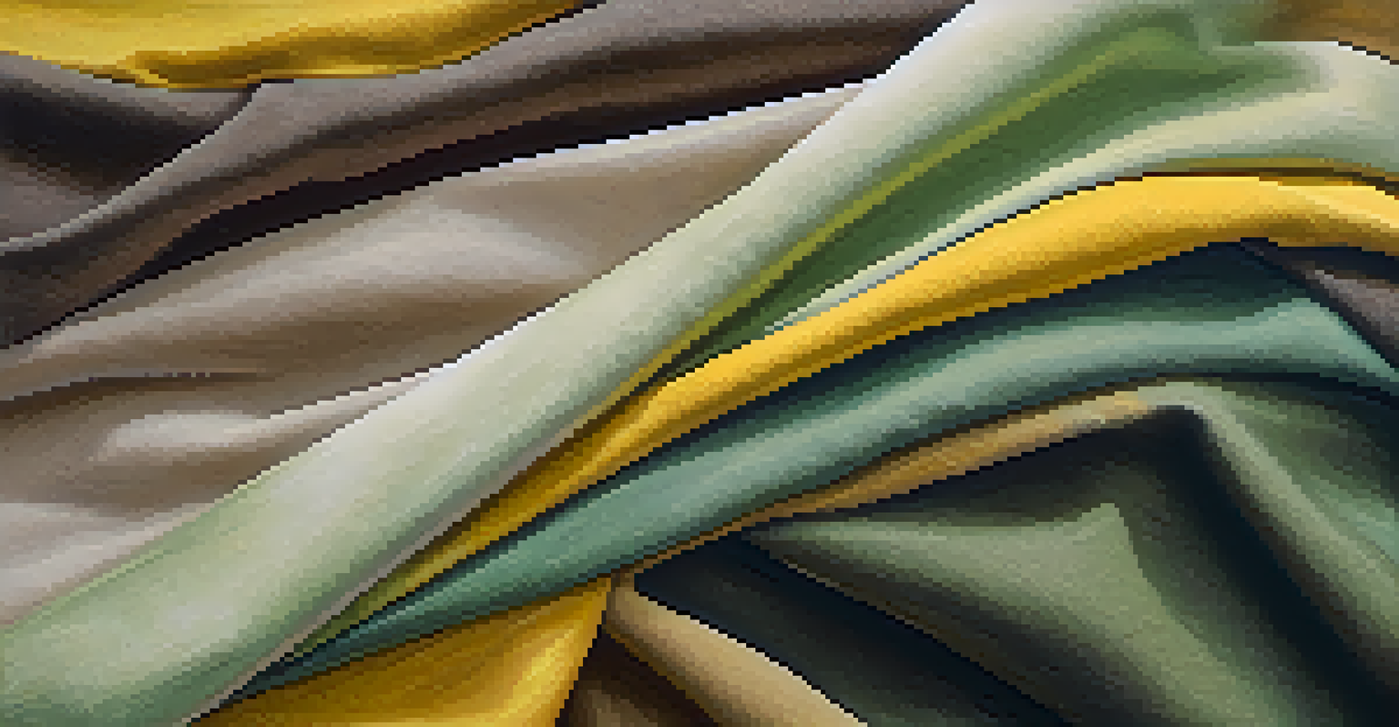
Texture refers to the surface quality of an artwork, whether it's smooth, rough, soft, or hard. It adds depth and dimension, inviting viewers to engage with the piece on a tactile level. For instance, the rough texture of a canvas can contrast beautifully with the smoothness of oil paint, creating a dynamic visual experience.
Incorporating various textures can enhance the emotional tone of an artwork. A rough, jagged surface might express chaos or tension, while a soft, delicate texture could evoke feelings of tranquility and peace. This interplay of textures helps to create a more immersive experience for the viewer.
Color Evokes Emotion in Art
The choice of color significantly influences the emotional response of viewers, shaping their interpretation of the artwork.
Artists often experiment with different materials to achieve unique textures. For example, using mixed media can allow for the combination of paper, fabric, and paint, resulting in a multi-layered composition that captivates the audience.
How Color and Texture Interact
Color and texture are like dance partners in an artwork; they influence one another and create a cohesive visual experience. For example, a bright, glossy finish can make a color appear more vibrant, while a matte texture might soften a hue. This relationship can dramatically affect the mood of the piece.
Texture is the tactile quality of a surface, and it plays a significant role in how we perceive the world around us.
When combined effectively, color and texture can guide the viewer's eye and enhance focal points within the composition. Think of a canvas where a textured area bursts with bright color—this draws attention and creates a focal point that stands out against smoother, muted sections.
Understanding how to balance these elements is crucial for artists. A piece that overuses bold colors with heavy texture might overwhelm the viewer, while a harmonious blend can lead to a captivating and memorable work of art.
Emotional Responses to Color and Texture
Both color and texture elicit emotional responses, making them powerful tools for artists. For example, a piece dominated by dark colors and rough textures may evoke feelings of sadness or despair, while bright colors combined with soft textures can inspire joy and comfort. This emotional dimension adds another layer to the interpretation of art.
Artists often use color and texture intentionally to influence how viewers feel about their work. A serene landscape painted in soft blues and greens with a smooth texture can create a sense of peace, while a chaotic abstract piece with jagged shapes and vibrant reds might generate excitement or anxiety.
Texture Adds Depth and Engagement
Texture enhances the visual experience by adding depth and inviting viewers to engage with the artwork on a tactile level.
This ability to evoke emotion is what makes art so impactful. When viewers connect emotionally with a piece, it becomes more than just a visual experience; it transforms into a personal journey.
Creating Contrast with Color and Texture
Contrasting elements in art can create tension and interest, making a composition more engaging. By juxtaposing rough textures with smooth areas, or combining warm colors with cool ones, artists can create visual dialogues that capture attention. This contrast invites viewers to explore the artwork more deeply.
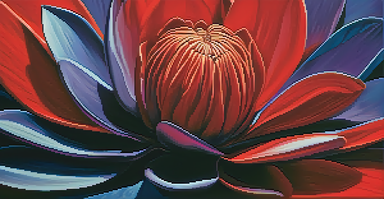
Imagine a painting where the vibrant color of a flower stands out against a rough, textured background. This contrast not only highlights the flower but also adds complexity to the composition, making the viewer pause and appreciate the interplay between the two elements.
Effective use of contrast can also guide the viewer's gaze. An artist might lead the eye through a piece by alternating between contrasting textures and colors, creating a sense of movement and flow that enhances the overall impact.
The Importance of Harmony in Composition
While contrast can be striking, harmony is equally important in art. A balanced composition that thoughtfully integrates color and texture can create a sense of unity. For example, using a consistent color palette with varying textures can tie a piece together, making it feel cohesive and complete.
Artists can achieve harmony through repetition of colors and textures. By using a specific color in various shades or a particular texture throughout the work, the artist creates a rhythm that can be pleasing to the eye. This approach can evoke a sense of calm and order within the artwork.
Contrast and Harmony Are Essential
Balancing contrast and harmony in a composition creates visual interest and a cohesive experience for the viewer.
Ultimately, achieving harmony involves a delicate balance. Artists must consider how each element interacts to create a composition that feels intentional and well thought out.
Experimenting with Color and Texture in Your Own Art
For those looking to explore the relationship between color and texture, experimentation is key. Start by playing with different materials and tools to see how they affect your work. Using various brushes, sponges, or even your fingers can produce unexpected textures that can enhance your color choices.
Consider creating a series of small studies focusing on different color and texture combinations. By limiting your palette or sticking to a specific texture, you can better understand how these elements interact and influence the overall composition. This practice can help you develop your unique artistic voice.
Remember, there are no strict rules in art. Don’t be afraid to break conventions and allow your intuition to guide you. The journey of exploration can lead to exciting discoveries and a deeper appreciation for the role color and texture play in your artistic expression.