The Science of Color Mixing: Practical Techniques for Artists
Understanding the Color Wheel and Primary Colors
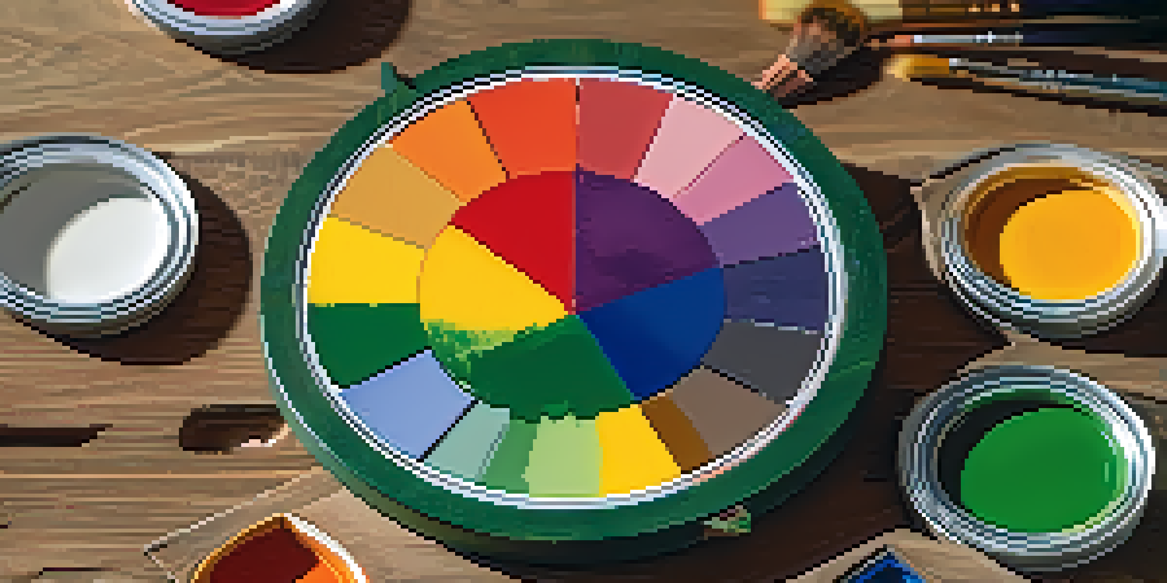
The color wheel is a fundamental tool for artists, illustrating the relationships between colors. At its core, we have primary colors: red, blue, and yellow. These colors cannot be created by mixing other colors, but they serve as the foundation for all other hues.
Color is the keyboard, the eyes are the harmonies, the soul is the piano with many strings.
When you mix primary colors, you create secondary colors: green, orange, and purple. For instance, mixing blue and yellow gives you green, while red and blue yield purple. Understanding this wheel helps artists visualize how colors interact and can lead to more harmonious artwork.
By grasping the basics of the color wheel, you can make informed decisions about color mixing. This knowledge not only enhances your palette but also allows for more creative experimentation. So, consider this wheel your trusted map in the vibrant world of color!
The Psychology of Color: Emotions and Associations
Color isn't just about aesthetics; it also evokes emotions and conveys messages. For example, warm colors like red and orange can inspire feelings of energy and passion, while cool colors like blue and green often promote calm and relaxation. Understanding these associations can significantly impact your artwork's effectiveness.

Artists can use color psychology to guide their choices and enhance the narrative of their pieces. A landscape might feel more tranquil with soft greens and blues, while a vibrant sunset could be painted with intense reds and oranges to evoke warmth. This psychological aspect of color can deepen the viewer's emotional response.
Master the Color Wheel Basics
Understanding primary and secondary colors through the color wheel is essential for artists to create harmonious and vibrant artwork.
By harnessing the power of color psychology, you can create pieces that resonate on a deeper level. Remember, the colors you choose are not just about what looks good—they can tell a story and evoke feelings. So, consider what emotions you want to communicate through your palette.
Color Mixing Techniques: Additive vs. Subtractive
Color mixing can be broadly categorized into two techniques: additive and subtractive. Additive mixing occurs when light is combined, such as on digital screens, where red, green, and blue light blend to create a spectrum of colors. This method is essential for digital artists to understand as it differs from traditional mixing.
Colors are the smiles of nature.
On the other hand, subtractive mixing happens with pigments, like paints. Here, colors are created by subtracting light; for instance, mixing yellow and blue paint results in green, as the combined pigments absorb (subtract) certain wavelengths of light. This method is crucial for traditional artists working with physical media.
Knowing the difference between additive and subtractive mixing helps you choose the right approach for your medium. Whether you're creating a digital illustration or a canvas painting, understanding these techniques ensures your colors mix effectively, producing the desired results.
Creating Tints, Shades, and Tones
When working with colors, you can modify them to create tints, shades, and tones. A tint is created by adding white to a color, making it lighter; for example, mixing white with red results in pink. This technique is useful for softening colors and adding depth to your palette.
Conversely, a shade is formed by adding black to a color, resulting in a darker hue. For instance, combining black with blue creates navy. This method can add drama and intensity to your artwork, allowing for more striking contrasts.
Utilize Color Psychology
Colors evoke emotions and can significantly impact the viewer's response, making it vital for artists to consider the feelings they want to convey.
Tones are created by adding gray to a color, which can mute its intensity. This technique is particularly useful for creating subtle variations in color that can enhance realism in paintings. By manipulating tints, shades, and tones, you can achieve a richer and more sophisticated color palette.
Using Complementary Colors for Impact
Complementary colors are located opposite each other on the color wheel, such as red and green or blue and orange. When used together in a piece, they create a striking contrast that can grab a viewer's attention. This technique can be particularly effective in highlighting focal points in your artwork.
For example, placing a bright orange object against a blue background can make both colors pop, enhancing their vibrancy and impact. This concept is crucial for artists looking to create dynamic compositions that draw the eye and maintain interest.
However, it's essential to use complementary colors judiciously. Too much contrast can overwhelm the viewer, so finding the right balance is key. Experimenting with varying proportions of complementary colors can help you understand how they interact and how to use them effectively in your art.
The Role of Color Harmony in Art
Color harmony refers to a pleasing arrangement of colors that work well together. Artists often strive for harmony to create a sense of balance and unity within their work. Techniques such as analogous color schemes, which use colors next to each other on the wheel, can evoke a serene feeling.
Alternatively, a triadic color scheme—using three colors that are evenly spaced on the wheel—can create vibrant and energetic compositions. For instance, combining red, blue, and yellow can result in a lively artwork full of contrast and excitement. Understanding these schemes allows you to plan your palette effectively.
Explore Mixing Techniques
Differentiating between additive and subtractive color mixing helps artists effectively choose the right approach for their medium.
Ultimately, achieving color harmony is about experimentation and intuition. Don’t be afraid to play with different combinations and see what resonates with you. By developing your eye for color harmony, you'll create more cohesive and visually appealing pieces.
Practical Tips for Effective Color Mixing
To improve your color mixing skills, start by practicing with a limited palette. Using just a few colors forces you to understand how they interact and can lead to unexpected discoveries. For example, mixing just red, yellow, and blue can yield a wide range of colors, helping you appreciate the nuances.
Additionally, keep a color mixing journal where you document your experiments. Note down the ratios of colors used and the outcomes. This record can serve as a valuable reference for future projects and help you develop your unique approach to color mixing.
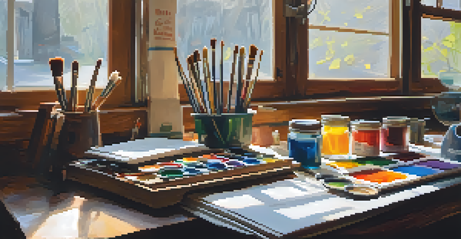
Lastly, don’t hesitate to learn from other artists. Watching tutorials or attending workshops can provide new insights and techniques. Remember, mastering color mixing is an ongoing journey, and every artist brings their own flair to the canvas!