Using Color Gradients to Enhance Visual Flow in Artworks
Understanding Color Gradients and Their Importance
Color gradients are smooth transitions between different colors, creating a visually appealing effect. They can evoke emotions, guide the viewer's eyes, and enhance the overall aesthetic of an artwork. By blending colors seamlessly, artists can create depth and dimension, making their pieces more dynamic.
Color is a power which directly influences the soul.
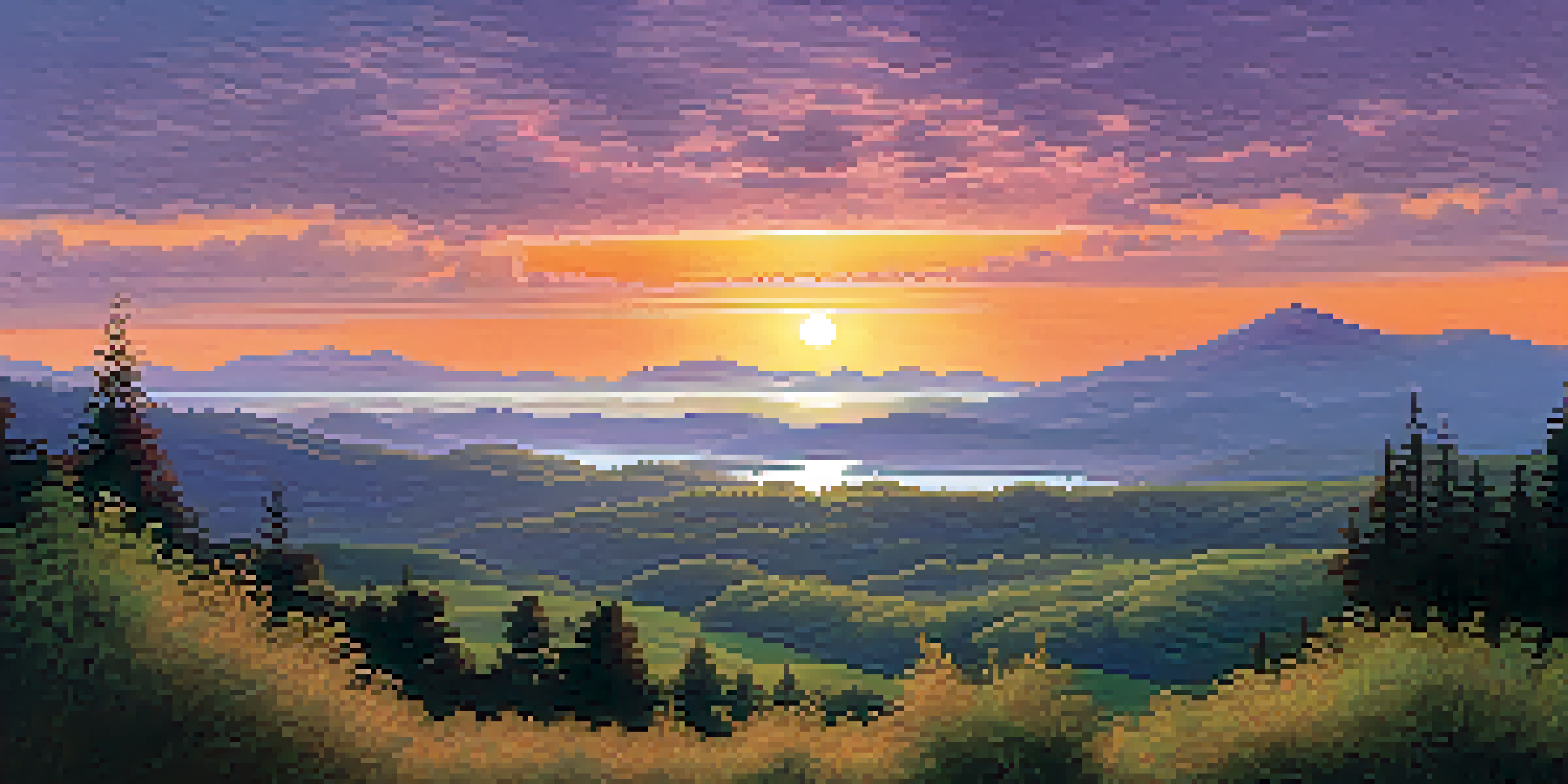
For instance, think of a sunset where the deep orange melts into a soft purple. This gradient not only captures the beauty of the moment but also creates a sense of calm and wonder. Such effects can be replicated in various art forms, from paintings to digital designs.
Understanding how to effectively use color gradients can significantly transform an artwork's impact. They serve as a powerful tool for artists to convey their message and engage their audience.
Creating Emotional Impact with Color Gradients
Colors have the power to evoke specific emotions, and gradients can amplify this effect. For example, a gradient that shifts from warm reds to cool blues may create a sense of tension or conflict, while smooth transitions from light to dark can convey tranquility or introspection. Artists can leverage these emotional cues to enhance their storytelling.
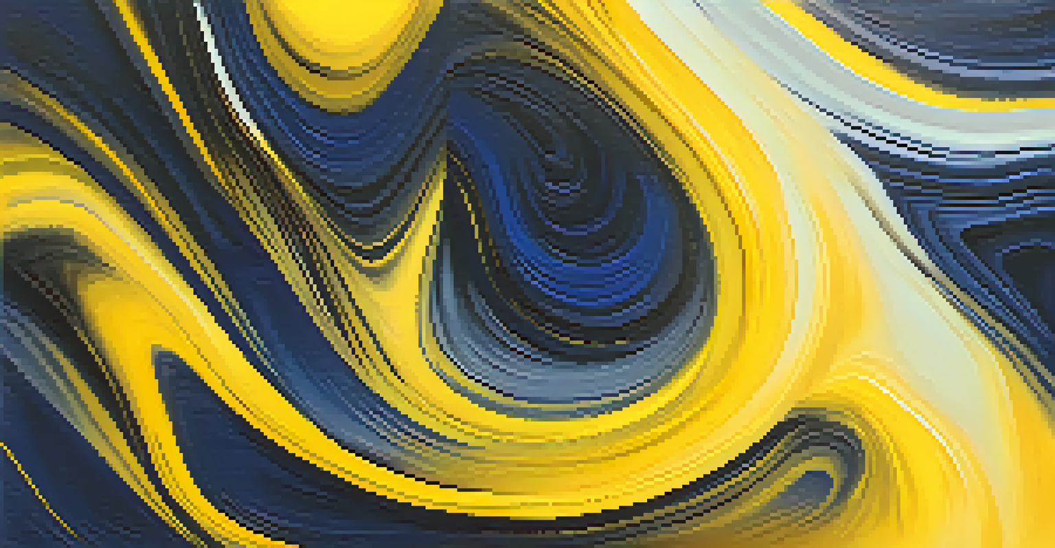
Imagine a painting where the background transitions from a bright yellow to a deep navy blue. This gradient can symbolize the journey from joy to melancholy, offering the viewer a deeper narrative to explore. The emotional resonance of color gradients allows artists to connect with their audience on a more profound level.
Gradients Enhance Visual Appeal
Color gradients create smooth transitions that add depth and aesthetic quality to artwork.
By thoughtfully choosing color gradients, artists can not only beautify their work but also evoke emotions that resonate with viewers. This emotional connection can make a piece memorable, leaving a lasting impression.
Guiding the Viewer’s Eye with Gradients
One of the key functions of color gradients is to guide the viewer's eye through an artwork. By strategically placing gradients, artists can create focal points and lead the viewer's gaze along a desired path. This method is essential in ensuring that the composition feels cohesive and balanced.
Colors are the smiles of nature.
Consider a landscape painting where the foreground features bright, warm colors that gradually transition to cooler tones in the background. This gradient not only creates depth but also naturally directs the viewer's attention from the foreground to the horizon. It establishes a visual flow that enhances the overall experience of the artwork.
Using gradients as a navigation tool can elevate the storytelling aspect of art. When viewers can easily follow along the intended visual path, they are more likely to engage deeply with the piece.
Enhancing Depth and Dimension with Gradients
Color gradients can create a sense of depth and dimension that flat colors often lack. By employing techniques like shading and blending, artists can simulate three-dimensionality, making objects appear more lifelike. This illusion of depth can draw viewers in, making them feel as if they are part of the scene.
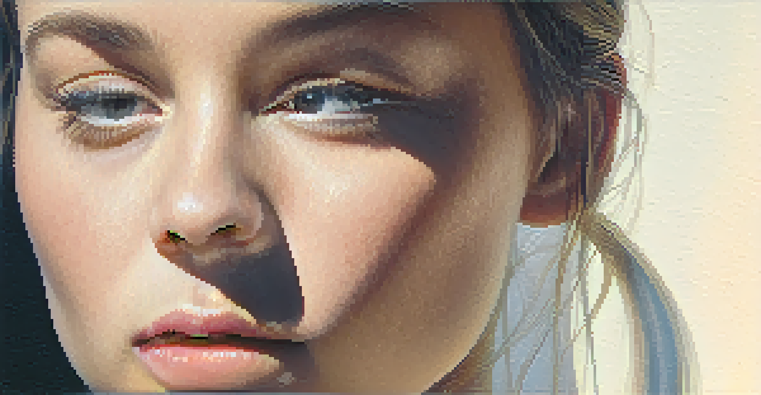
For example, in a portrait, a subtle gradient from light to shadow on the face can accentuate the contours, bringing the subject to life. This technique adds a layer of realism that captivates the viewer's attention and enhances the emotional depth of the artwork.
Emotional Connections Through Color
By using gradients, artists can evoke specific emotions, deepening the viewer's engagement with the piece.
By mastering the use of gradients, artists can transform their work from two-dimensional to three-dimensional, adding richness and complexity that engages the audience’s imagination.
Choosing the Right Color Combinations for Gradients
The effectiveness of a gradient heavily depends on the colors chosen. Artists must consider the psychological effects of colors, as well as how they interact with each other when blended. Complementary colors can create vibrant, eye-catching gradients, while analogous colors offer a more harmonious and soothing effect.
For instance, a gradient transitioning from green to blue can evoke feelings of calmness and serenity, making it perfect for a nature-themed artwork. Conversely, a shift from yellow to red can generate excitement and energy, suitable for more dynamic pieces.
Understanding color theory and the emotional responses associated with different colors can help artists make intentional choices. This strategic selection can greatly enhance the visual impact of their gradients.
Practical Techniques for Applying Color Gradients
Applying color gradients can be done through various techniques, whether traditional or digital. In painting, artists may use brushes or sponges to blend colors smoothly on the canvas. In digital art, tools like gradient maps and blending modes allow for precise control over the gradient application.
For example, a digital artist might use a linear gradient tool to create a seamless transition between two colors, adjusting the opacity for a softer effect. This flexibility allows for experimentation and refinement, enabling artists to achieve their desired look.
Guiding the Viewer’s Attention
Strategically placed color gradients can direct the viewer's gaze, enhancing the storytelling aspect of art.
Regardless of the medium, mastering gradient application techniques can significantly enhance the visual flow of an artwork. This mastery provides artists with the freedom to express their creativity in new and exciting ways.
Showcasing Color Gradients in Different Art Forms
Color gradients are not limited to traditional painting; they can be found in various art forms, including photography, graphic design, and digital illustrations. Each medium offers unique ways to implement gradients, showcasing their versatility and effectiveness. Artists can explore these different avenues to find what resonates best with their style.
For instance, in graphic design, gradients are often used in backgrounds to create depth and interest without overwhelming the main subject. Similarly, in photography, a gradient filter can enhance the sky's colors, adding drama and flair to landscape images.
Embracing the use of gradients across different art forms can open up new creative possibilities. It encourages artists to experiment and innovate, ultimately enhancing their artistic expression.
Final Thoughts on Using Color Gradients in Art
Incorporating color gradients into artworks is a powerful way to enhance visual flow, emotional impact, and overall aesthetics. As artists experiment with gradients, they discover new dimensions to their creativity and storytelling. This technique not only beautifies art but also invites deeper engagement from viewers.
Whether through traditional painting or modern digital art, understanding and applying color gradients can elevate an artist’s work to new heights. It's about more than just color; it's about creating a connection and a journey for the viewer.
As you explore the world of color gradients, remember to have fun and let your creativity flow. Every gradient tells a story, and by mastering this technique, you can enrich your artistic narrative.