Warm and Cool Color Interactions: Effects on Perception
Understanding Warm and Cool Colors: A Basic Overview
Colors can be broadly categorized into warm and cool hues. Warm colors, such as red, orange, and yellow, evoke feelings of warmth, energy, and excitement. In contrast, cool colors like blue, green, and purple tend to create a sense of calm, tranquility, and relaxation. This fundamental distinction is crucial in understanding how colors affect our perceptions and emotions.
Color is the keyboard, the eyes are the harmonies, the soul is the piano with many strings.
For instance, think about a vibrant sunset that bathes the sky in oranges and pinks. It often makes us feel uplifted and inspired. On the other hand, a serene blue ocean can evoke feelings of peace and contentment. Recognizing these emotional responses helps us appreciate the broader impact of colors in our lives.
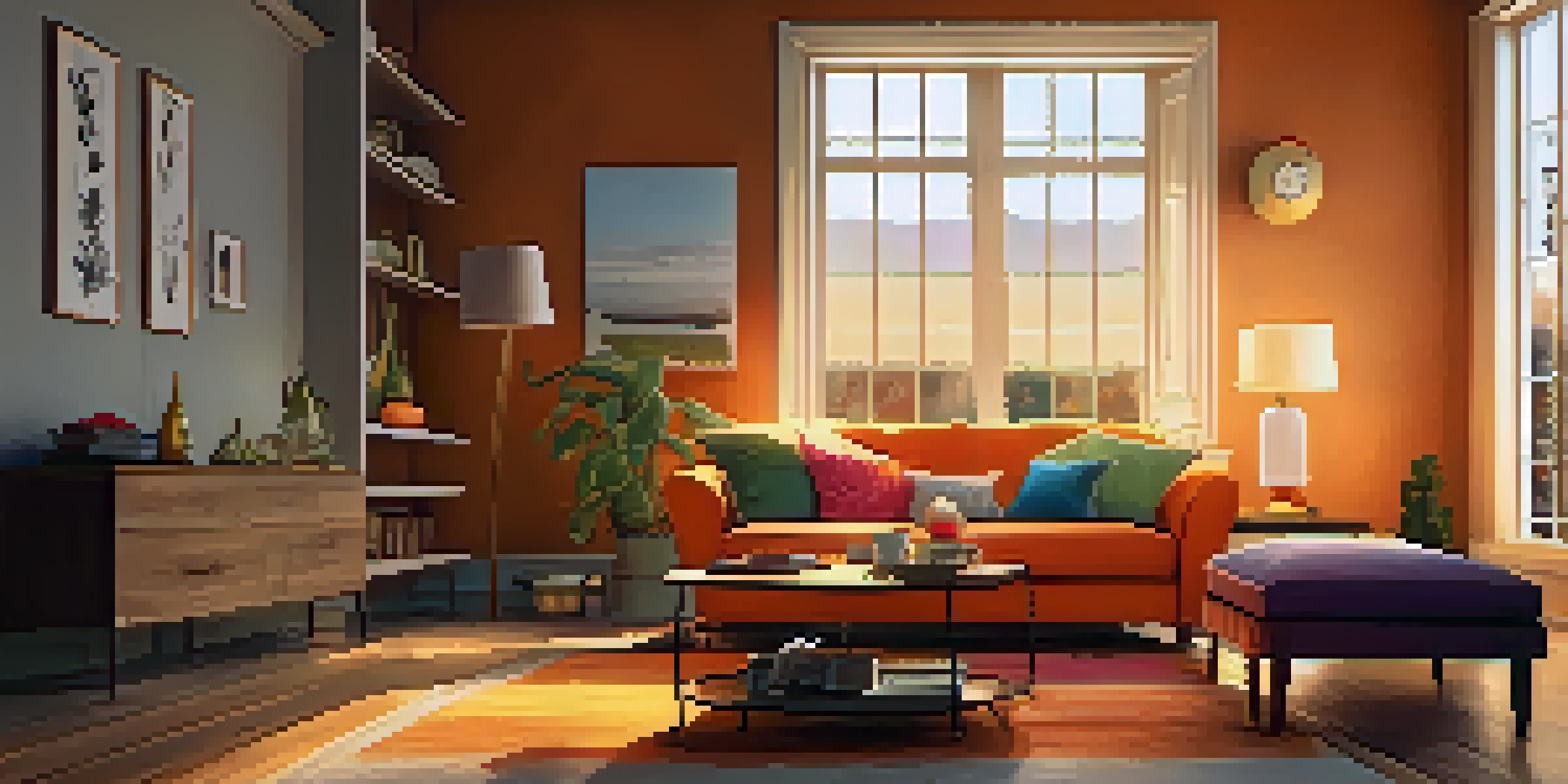
Additionally, the context in which colors are used can amplify their effects. An orange in a cozy living room can feel inviting, while the same shade in a clinical setting might feel overwhelming. Understanding this interplay is essential for anyone looking to use color effectively in design or art.
The Psychological Impact of Warm Colors
Warm colors are often associated with heightened emotions and energy. They can stimulate feelings of passion, excitement, and even aggression. For example, a room painted in fiery red might energize its occupants, making it ideal for social gatherings but potentially overwhelming for quiet reflection.
Moreover, warm colors can increase heart rates and create a sense of urgency. This is why you often see red in marketing materials or fast-food restaurants, where a quick decision is encouraged. The psychological effects of warm colors are powerful tools in shaping our behaviors and moods.
Warm Colors Energize and Engage
Warm colors like red and orange stimulate emotions and energy, making them effective in social settings.
However, it's essential to balance warm colors with cooler tones to avoid overwhelming sensations. A splash of blue or green can temper the intensity of red, creating a more harmonious environment. This balance can lead to a more inviting space that promotes both energy and relaxation.
The Calming Effects of Cool Colors
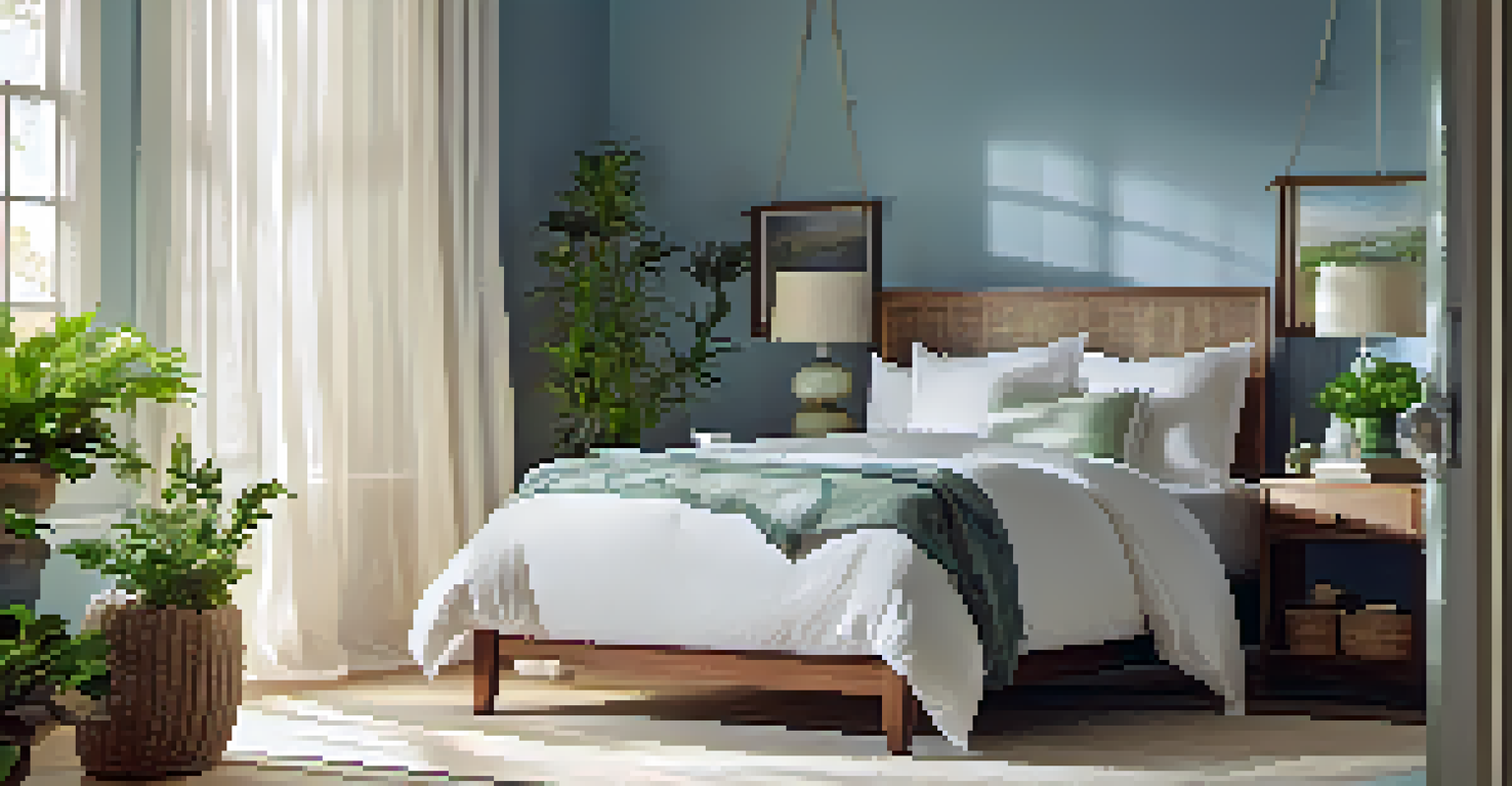
Cool colors are known for their calming and soothing effects. Shades of blue and green are often associated with nature, evoking feelings of tranquility and peace. This is one reason why many people opt for these colors in bedrooms or healthcare environments where relaxation is a priority.
Colors are the smiles of nature.
Interestingly, research shows that cool colors can lower blood pressure and reduce stress levels. Imagine walking through a lush green forest or gazing at a clear blue sky; both experiences can help you feel more grounded and at ease. This natural connection makes cool colors an excellent choice for spaces meant for rest and recuperation.
In design, incorporating cool colors can create a serene atmosphere, but they can also be perceived as distant or cold if overused. A thoughtful balance with warm colors can maintain a welcoming environment without sacrificing the calming effects. This interplay is crucial for achieving the desired mood in any space.
Color Combinations: The Dance of Warm and Cool
The interaction between warm and cool colors can be truly captivating. When strategically combined, they can create dynamic contrasts that draw attention and influence perception. For example, pairing a warm orange with a cool blue can evoke a sense of vibrancy while maintaining balance.
This balance can be likened to the harmony in music, where different notes come together to create something beautiful. Similarly, in visual design, contrasting colors can enhance aesthetics while also influencing emotions. This is a reason why artists and designers pay close attention to color theory.
Cool Colors Promote Calmness
Cool colors such as blue and green evoke feelings of tranquility and peace, ideal for relaxation spaces.
Furthermore, the context of these combinations is essential. A splash of warm colors against a cool backdrop can create focal points that guide the viewer’s eye. Understanding how to effectively mix these colors can elevate the impact of any design work, making it engaging and memorable.
Cultural Perspectives on Color Perception
Cultural background significantly influences how individuals perceive colors. For instance, while red might signify love and passion in Western cultures, it can represent danger or mourning in others. These varying interpretations highlight the importance of cultural context in color interactions.
Cool colors can also carry different meanings. In some cultures, blue is associated with tranquility and peace, while in others, it might symbolize sadness. This complexity adds another layer to understanding how colors can affect perception and emotional responses.
When designing for a diverse audience, it’s crucial to consider these cultural nuances. What feels warm and inviting to one group might feel uncomfortable to another. By being aware of these differences, designers can craft spaces and visuals that resonate positively across various cultures.
Practical Applications of Color Theory
Understanding color interactions can significantly enhance various fields, from interior design to marketing. In interior spaces, a mix of warm and cool colors can set the desired tone for a room. For example, a cozy café might use warm colors to create an inviting atmosphere, while a spa might lean towards cool colors to promote relaxation.
In marketing, colors can be strategically used to elicit specific emotional responses from consumers. A brand might use warm colors to convey excitement and energy while employing cooler tones to cultivate trust and reliability. This thoughtful application of color theory can lead to stronger brand connections and consumer loyalty.
Balance Enhances Color Interactions
Combining warm and cool colors thoughtfully creates dynamic contrasts that influence perception and mood.
Furthermore, artists and graphic designers can leverage color interactions to evoke emotions and create storytelling elements in their work. By mixing warm and cool colors, they can guide viewers through a visual journey, enhancing the overall experience and connection to the piece.
Conclusion: Embracing the Power of Color Interactions
In conclusion, the interplay between warm and cool colors holds significant power in shaping our perceptions and emotions. By understanding the psychological impacts and cultural nuances associated with these colors, we can harness their potential in various applications. Whether it’s designing a space, marketing a product, or creating art, color choices can profoundly influence how we feel and react.
As we've explored, the balance between warm and cool colors can foster environments that are both stimulating and calming. This dynamic can lead to spaces that not only look good but also feel right, enhancing our interactions and experiences. Thus, embracing color theory can transform our approach to design and communication.

Ultimately, colors are more than just visual elements; they have the power to evoke emotions, tell stories, and connect us to our environments. By appreciating and utilizing warm and cool color interactions, we can create more meaningful and impactful experiences in our daily lives.