Color Theory 101: Choosing the Right Shades for Your Space
Understanding the Basics of Color Theory
Color theory is the foundation for choosing the right colors in any space. It involves understanding how colors interact, influence emotions, and create harmony. By grasping the basics, you can make informed decisions that elevate your environment.
Color is the keyboard, the eyes are the harmonies, the soul is the piano with many strings.
At its core, color theory consists of the color wheel, which shows primary, secondary, and tertiary colors. Primary colors—red, blue, and yellow—can be mixed to create a range of other shades. This simple concept is the first step in creating a cohesive color palette for your space.
Additionally, color theory delves into warm and cool colors. Warm colors, like reds and oranges, evoke energy, while cool colors, such as blues and greens, promote tranquility. Knowing these effects can guide you in setting the mood for any room.
The Color Wheel: Your Best Friend in Design
The color wheel is a powerful tool in design that helps visualize relationships between colors. It’s divided into three main categories: primary, secondary, and tertiary colors, each offering unique combinations. By using the wheel, you can see how colors complement or contrast with one another.
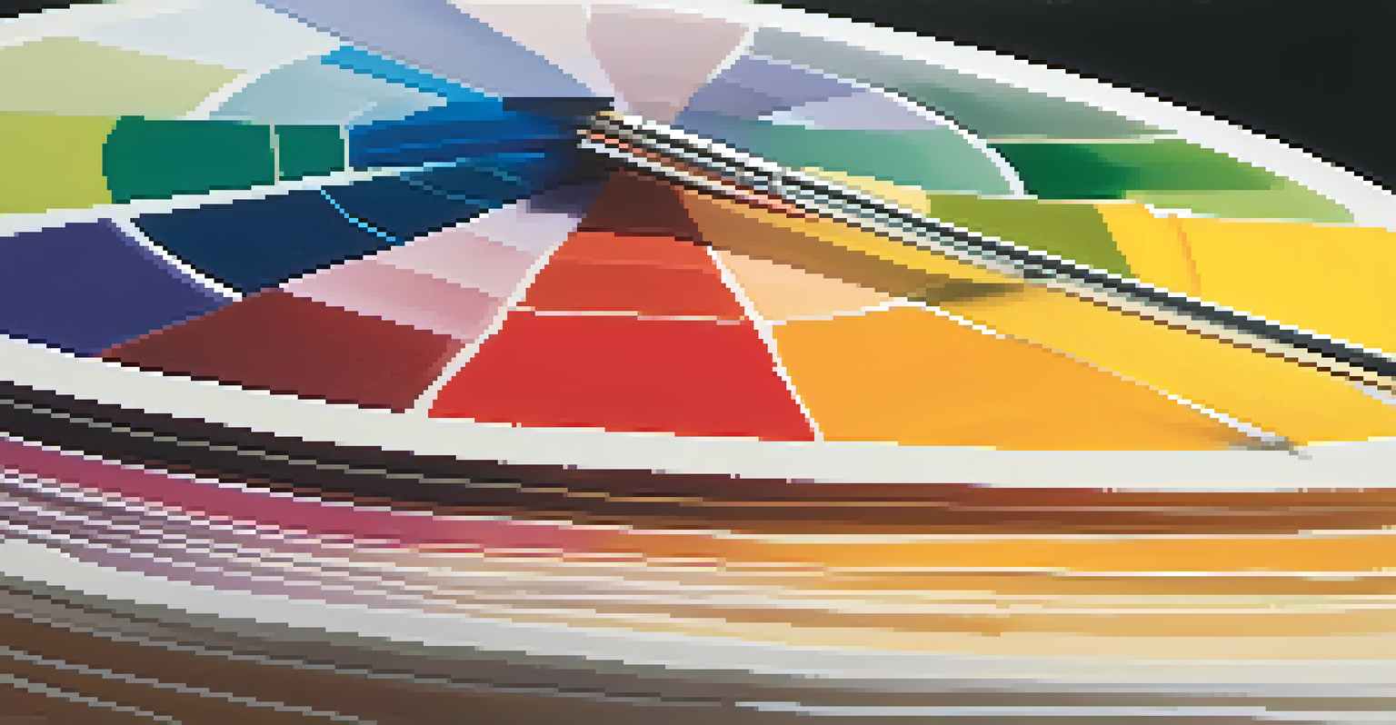
For instance, complementary colors are located opposite each other on the wheel, like blue and orange. When used together, they create a vibrant look that can energize a space. On the other hand, analogous colors, which sit next to each other, like blue, green, and teal, create a more harmonious and soothing atmosphere.
Color Theory Basics Explained
Understanding the fundamentals of color theory helps you choose colors that harmonize and influence emotions in your space.
Understanding the color wheel not only aids in selecting colors but also in balancing them throughout your space. It can help you avoid overwhelming combinations that clash and lead to visual chaos.
The Psychology of Color: Emotions and Spaces
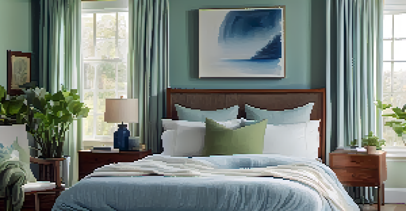
Colors can significantly affect our emotions and perceptions, making color psychology an essential aspect of design. For example, the color blue is often associated with calmness and serenity, making it a popular choice for bedrooms and bathrooms. Conversely, yellow evokes feelings of happiness and energy, ideal for kitchens or playrooms.
Colors are the smiles of nature.
By considering the psychological impact of colors, you can tailor your space to reflect the mood you want to create. For example, if you’re looking to promote productivity in a home office, shades of green or blue may be beneficial.
Incorporating color psychology into your design decisions allows you to create spaces that resonate with how you want to feel. It’s a powerful way to enhance your environment simply through color choices.
Choosing a Color Palette: Tips for Success
Selecting a color palette can feel daunting, but there are strategies to simplify the process. Start by identifying a primary color that resonates with you and serves as the base for your palette. From there, consider adding two to three complementary or analogous colors for balance and depth.
Another effective method is the 60-30-10 rule, where 60% of the room is the dominant color, 30% is a secondary color, and 10% is an accent color. This approach creates a visually appealing space without overwhelming the senses.
The Importance of the Color Wheel
The color wheel is a vital tool that assists in visualizing color relationships, helping you select complementary and analogous colors effectively.
Lastly, test your color choices in the actual space before committing. Paint swatches on the walls and observe how they look at different times of the day, as lighting can drastically change the perception of color.
Creating Mood Boards: Visualizing Your Ideas
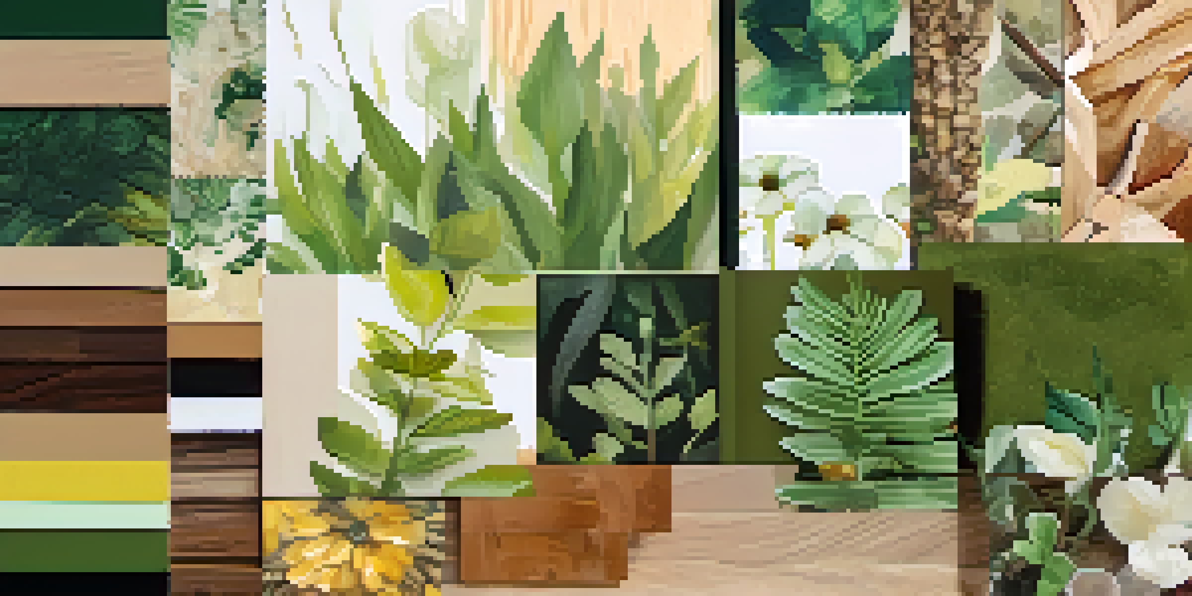
Mood boards are an excellent way to visualize your design ideas and color choices. They can be physical boards made from magazine cutouts or digital collages created using design software. Either way, mood boards allow you to see how different colors, textures, and patterns work together.
When creating a mood board, start by gathering inspiration from various sources—be it nature, art, or interior design websites. Focus on the colors that resonate with your vision for the space, and don’t hesitate to mix textures and patterns to bring your ideas to life.
This creative process not only helps clarify your vision but also boosts your confidence in decision-making. Seeing your concepts visually can lead to exciting revelations about what works best for your space.
Lighting: The Unsung Hero of Color Perception
Lighting plays a crucial role in how colors are perceived in a space. Natural light can make colors appear different throughout the day, while artificial lighting can either enhance or dull hues. Understanding this can help you choose the right colors for each room based on its lighting conditions.
For instance, warm light bulbs can make colors feel cozier, ideal for living rooms and bedrooms. Conversely, cool lighting can brighten and energize spaces, making it a great choice for kitchens and workspaces.
Lighting Impacts Color Perception
Recognizing how different lighting affects color perception is key to ensuring your chosen hues appear as intended in each room.
To ensure your colors shine, consider testing them under the type of lighting you plan to use. This way, you can avoid surprises and ensure your chosen hues look exactly how you envisioned.
Trends vs. Timelessness: Finding Your Style
When selecting colors for your space, it's important to find a balance between trendy and timeless shades. While it can be fun to incorporate popular colors, such as vibrant greens or calming blues, remember that trends fade. Opting for timeless colors can ensure your space remains stylish for years to come.
Consider using trendy colors as accents rather than the main palette. For example, a neutral base with pops of trendy colors through decor items can keep the space fresh without overwhelming it. This way, you can easily update the look without repainting the entire room.
Ultimately, your space should reflect your personal style. Take time to explore various options and select colors that resonate with you, ensuring your home feels both current and personal.