The Emotional Palette: Colors and Brush Techniques Combined

Understanding Color Psychology in Art
Color psychology is the study of how colors influence our emotions and behaviors. Artists have long recognized that different colors can evoke specific feelings—like blue often conveying calmness and red representing passion. By understanding these associations, artists can intentionally choose colors to communicate their intended message or emotion.
Color is the keyboard, the eyes are the harmonies, the soul is the piano with many strings.
For example, a painting dominated by warm colors such as oranges and yellows might create a sense of warmth and happiness, while cooler colors like greens and blues can evoke tranquility or sadness. An artist’s choice of color not only sets the mood but also guides the viewer's emotional response to the artwork.
Ultimately, color serves as a powerful tool in art, allowing creators to engage their audience on a deeper emotional level. By mastering color psychology, artists can enhance their storytelling and connect more profoundly with their viewers.
The Role of Brush Techniques in Expressing Emotion
Brush techniques are just as important as color choice when it comes to conveying emotion in art. Different brush strokes can create varying textures and effects, influencing how viewers feel about a piece. For instance, broad, sweeping strokes might express chaos or energy, while delicate, soft strokes could evoke serenity.
Consider Van Gogh's famous swirling brushwork in 'Starry Night.' His energetic strokes not only create movement but also convey intense emotion, reflecting his inner turmoil. This technique invites viewers to feel the artist's passion and emotion, making the artwork more relatable.
Color Influences Emotions in Art
Artists can evoke specific feelings through color choices, using warm colors for energy and cool colors for tranquility.
By experimenting with various brush techniques, artists can find new ways to express complex emotions, making their work more dynamic. The combination of color and brush technique creates a rich emotional tapestry that resonates with the audience.
Color Combinations That Evoke Strong Feelings
Certain color combinations can amplify emotions in a piece of art. For example, pairing complementary colors, like blue and orange or red and green, can create a vibrant contrast that elicits excitement or tension. These dynamic pairings draw the viewer's eye and enhance the emotional impact of the artwork.
Art is the most beautiful of all lies; it is the most wonderful of all truths.
On the other hand, analogous colors, such as blue, blue-green, and green, can create a more harmonious and calming effect. This subtle blending can evoke feelings of peace and tranquility, making it perfect for landscapes or serene scenes.
Ultimately, the right color combinations can dramatically influence how an artwork is perceived. Artists must consider how their choices will interact to effectively communicate the desired emotions.
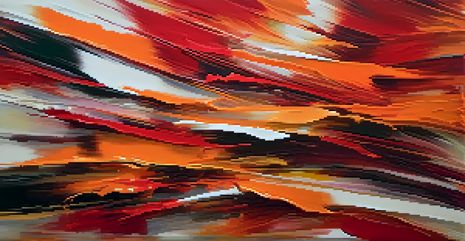
Using Warm Colors to Evoke Energy and Passion
Warm colors, such as reds, oranges, and yellows, are often associated with energy, excitement, and passion. These colors can create a sense of urgency or movement in a piece of art. For example, a painting featuring vibrant reds might invoke feelings of love or anger, effectively drawing viewers into the emotional narrative.
Artists often use warm colors to highlight focal points in their work, guiding the viewer’s eye to areas of importance. This technique not only captures attention but also builds an emotional connection around those highlighted areas.
Brush Techniques Convey Emotion
Different brush strokes create varying textures that significantly impact the emotional perception of a piece.
By strategically incorporating warm colors, artists can convey powerful emotions, making their work more engaging and impactful. This technique is especially effective in portraits and action scenes, where emotion is central to the composition.
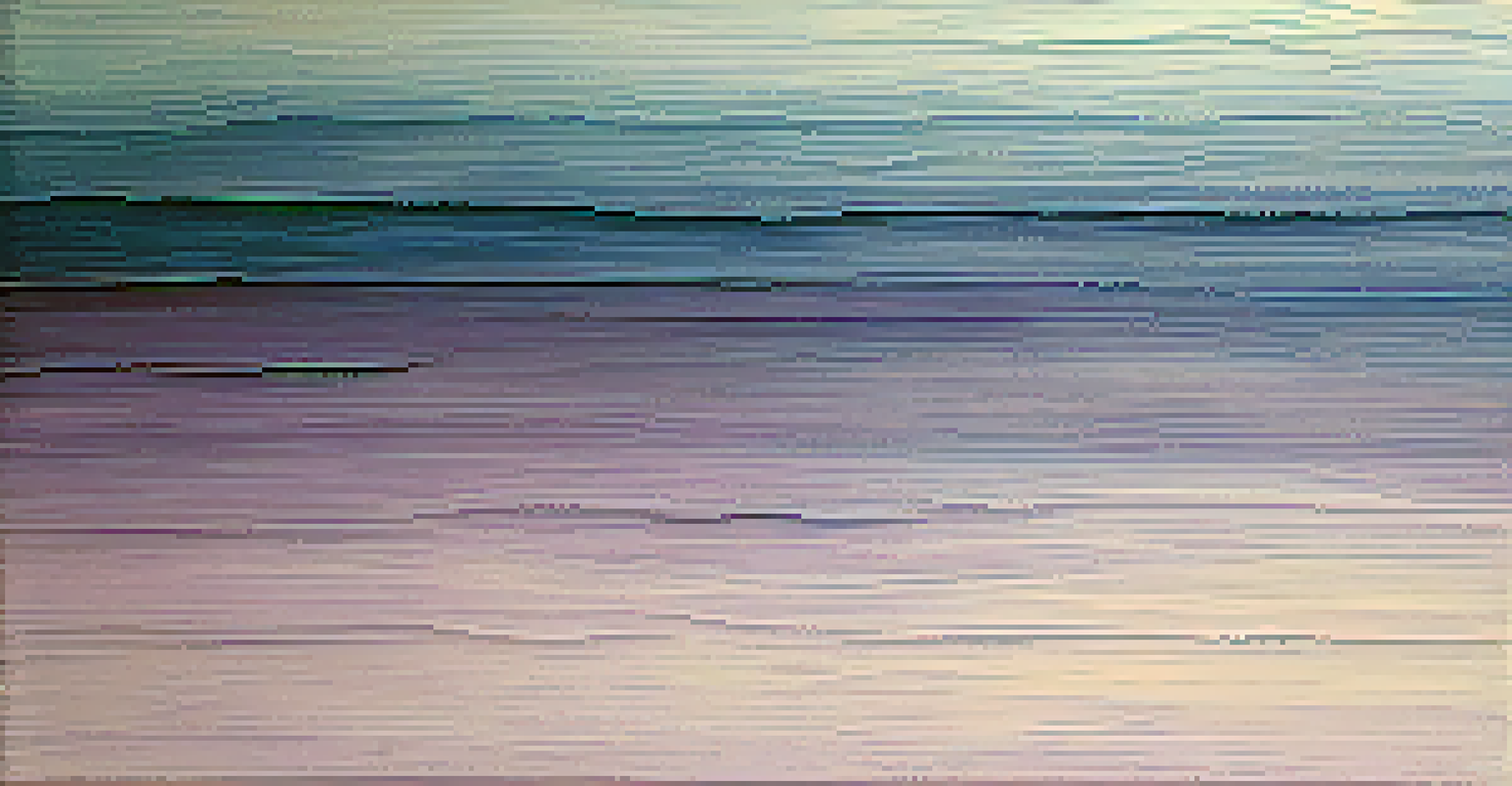
The Calming Effects of Cool Colors in Art
Cool colors like blue, green, and purple are often used to evoke calmness, tranquility, and introspection. These colors can create a soothing atmosphere, making them ideal for serene landscapes or contemplative pieces. For instance, a peaceful blue sky can instill feelings of serenity and openness.
Artists might use cool colors to balance out compositions or to create depth in their work. This thoughtful application can lead to a more layered emotional experience, inviting viewers to reflect on the feelings being portrayed.
Incorporating cool colors effectively allows artists to tap into a different spectrum of emotions, enhancing the overall mood of their artwork. This balance between warm and cool colors contributes to a more comprehensive emotional palette.
The Impact of Texture on Emotional Perception
Texture plays a crucial role in how emotions are perceived in art. The way paint is applied—whether thickly with palette knives or smoothly with brushes—can influence the viewer's emotional response. Textured surfaces can create a tactile experience, inviting the audience to connect with the artwork on a sensory level.
For example, a heavily textured painting may evoke feelings of ruggedness or intensity, while a smooth, polished surface can convey elegance and calm. The physicality of the artwork can deepen the emotional connection between the viewer and the artist’s intent.
Combining Elements Enhances Impact
The combination of colors and brush techniques allows artists to create a cohesive emotional narrative that resonates with viewers.
By experimenting with texture, artists can enhance their emotional expression, creating multi-dimensional experiences for viewers. This interplay between texture and emotion is a fascinating aspect of the artistic process.
Combining Colors and Techniques for Maximum Impact
The magic happens when artists skillfully combine colors and brush techniques to create a cohesive emotional narrative. This combination allows for a richer expression, where the colors enhance the meaning behind the chosen brush strokes. For instance, a vibrant red combined with aggressive, dynamic strokes can convey passion and turmoil.
Conversely, blending soft blues with gentle brushwork can evoke peace and reflection. This intentional pairing can guide the viewer's emotional journey, making the artwork not just visually appealing but also emotionally resonant.
Ultimately, mastering the combination of colors and techniques enables artists to create powerful pieces that speak to the heart. This synergy is what makes art an enduring form of communication, capable of transcending words.