Understanding Color Theory in Landscape Painting
What is Color Theory and Its Importance in Painting?
Color theory is essentially a set of guidelines about how colors interact. It helps artists understand how to mix colors and create harmonious palettes. This understanding is crucial in landscape painting, where nature’s colors are complex and dynamic.
Color is the keyboard, the eyes are the harmonies, the soul is the piano with many strings.
By grasping color theory, painters can evoke different moods and feelings in their work. For instance, cool colors like blues and greens can create a calm atmosphere, while warm colors like reds and yellows can energize a scene. This emotional impact is vital for storytelling through art.
Moreover, color theory aids in achieving balance and depth in a painting. By knowing how to use contrasting and complementary colors, artists can draw the viewer's eye and highlight focal points, which is essential in landscape compositions.
Understanding the Color Wheel and Its Applications
The color wheel is a visual representation of colors arranged according to their chromatic relationship. It consists of primary, secondary, and tertiary colors. Understanding this wheel allows landscape painters to see how colors relate to one another, making it easier to choose harmonious combinations.
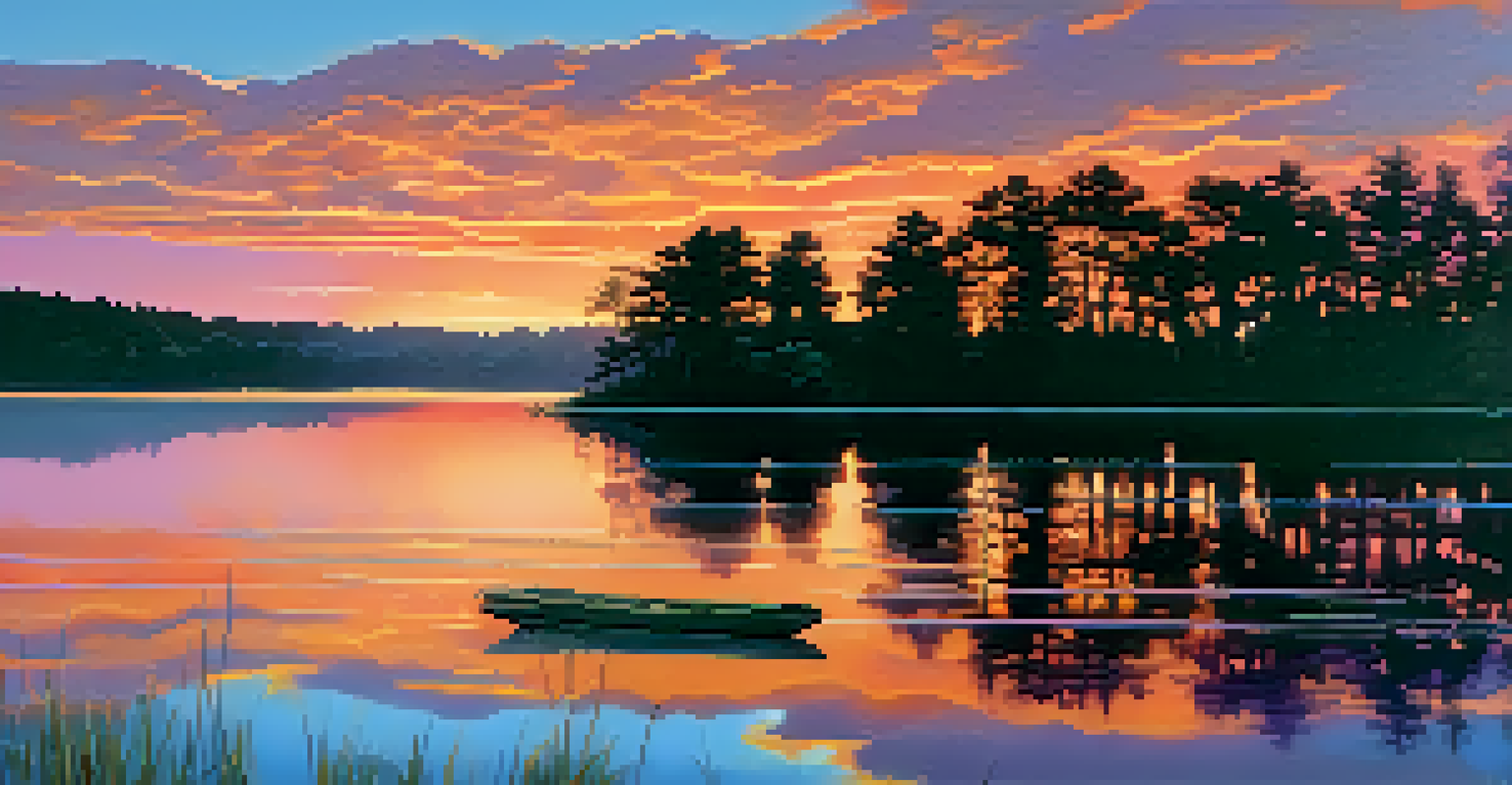
For example, if you're painting a sunset, the color wheel can guide you in selecting vibrant oranges and purples that complement each other beautifully. By using analogous colors—those next to each other on the wheel—you can create a serene, cohesive landscape.
Color Theory Guides Artistic Choices
Understanding color theory helps artists mix colors and create harmonious palettes that enhance the emotional impact of their landscape paintings.
Additionally, the color wheel helps artists understand complementary colors, which are opposite each other on the wheel. Using these colors together can create striking contrasts that add vibrancy and interest to a painting, perfect for capturing the essence of a lively landscape.
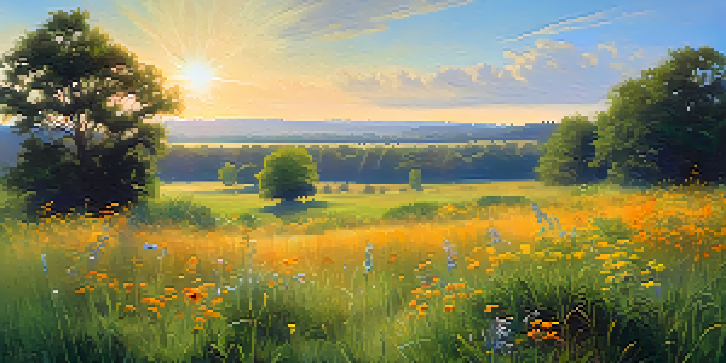
Warm and Cool Colors in Landscape Painting
Warm colors, such as reds, oranges, and yellows, tend to advance in a painting, making elements feel closer. In contrast, cool colors like blues and greens recede, creating a sense of depth. This principle is especially useful in landscapes, where depth and perspective are vital.
Colors, like features, follow the changes of the emotions.
For example, if you want to depict a sunlit meadow, using warm colors in the foreground can draw attention and create an inviting feel. On the other hand, cooler colors in the background can suggest distance and atmosphere, mimicking how we perceive landscapes in real life.
Understanding how to balance warm and cool colors can greatly enhance your work. By strategically placing warm colors against cool ones, you can create dynamic scenes that feel alive and engaging, inviting viewers into your painted world.
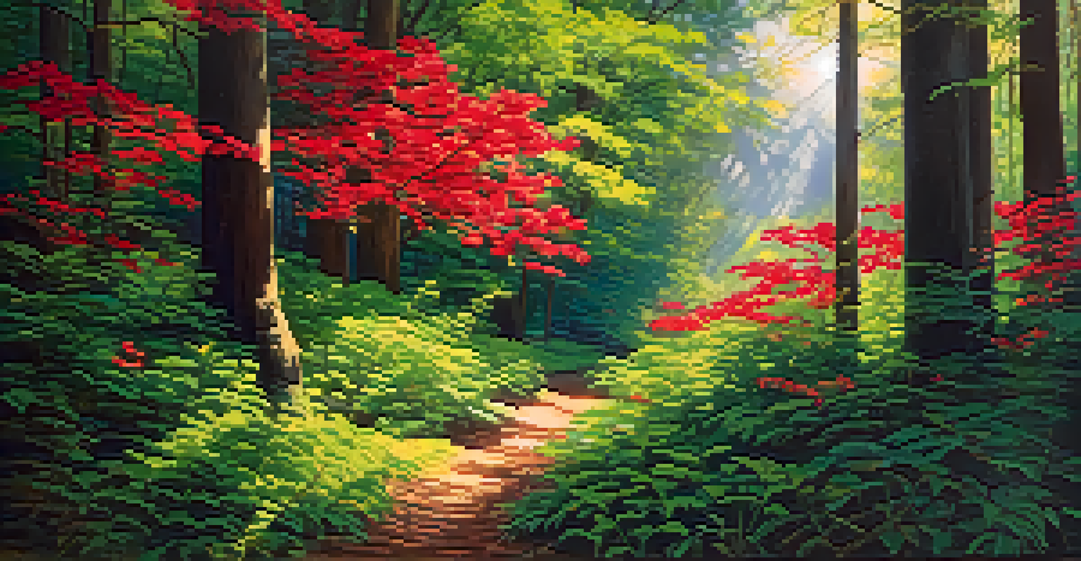
The Role of Complementary Colors in Landscapes
Complementary colors are pairs of colors that, when combined, cancel each other out, resulting in a grayscale color. In landscape painting, using complementary colors can create striking visual effects, enhancing the vibrancy of your work.
For instance, if you're painting a lush green forest, adding touches of red can make the greens pop, drawing the viewer's eye immediately. This technique not only adds depth but also brings a sense of excitement to the painting.
The Color Wheel Simplifies Compositions
The color wheel aids artists in selecting harmonious color combinations and understanding the relationships between colors for more effective landscape compositions.
Moreover, complementary colors can help in creating shadows and highlights. By adding a touch of the opposite color to a hue, artists can achieve more realistic tones that reflect the complexities of natural light.
Exploring Color Harmony and Its Significance
Color harmony refers to the pleasing arrangement of colors in a painting. It’s an essential aspect of landscape painting, as it helps create a unified and aesthetically appealing piece. Achieving harmony can make your paintings resonate more with viewers.
There are different schemes for achieving color harmony, such as monochromatic, analogous, and triadic schemes. Each has its unique effect; for instance, a monochromatic scheme can convey simplicity and calm, while a triadic scheme can add vibrancy and energy to a landscape.
Understanding and applying these harmony principles can elevate your work. When colors are in harmony, they create a sense of balance that draws viewers in, allowing them to appreciate the beauty of your landscape painting fully.
The Impact of Light on Color Perception
Light plays a crucial role in how we perceive colors in landscape painting. The quality and direction of light can dramatically alter the appearance of colors, affecting everything from shadows to highlights. This understanding is key for any artist aiming to depict nature authentically.
For instance, during sunrise or sunset, colors become warmer and more vibrant, which can be captured in your painting to convey mood. Conversely, midday light can wash out colors, creating a different atmosphere that can also be beautiful in its own right.
Light Influences Color Perception
The quality and direction of light significantly change how colors are perceived, making it essential for artists to consider lighting when depicting landscapes.
Being aware of light's effects can help artists choose their color palette more effectively. By studying how light interacts with colors in nature, you can create landscapes that feel both realistic and evocative.
Practical Tips for Implementing Color Theory
To apply color theory in your landscape paintings, start by experimenting with a limited palette. Limiting your colors at first can help you focus on the relationships between them and how they work together. This practice fosters a deeper understanding of color mixing and harmony.
Additionally, consider creating a color chart or wheel specific to your chosen landscape. Documenting how different colors interact under various lighting conditions can serve as a valuable reference for future paintings.
Finally, don’t shy away from practice. Regularly painting en plein air—outdoors—can help you observe and apply color theory in real-time, allowing you to capture the essence of landscapes as they truly are.