The Use of Color in Portrait Painting: Techniques Explored

The Importance of Color in Portrait Painting
Color plays a pivotal role in portrait painting, helping to convey the subject's emotions and personality. A well-chosen color palette can evoke feelings and set the mood of the artwork. For instance, warm colors like reds and yellows can suggest warmth and approachability, while cool colors such as blues and greens often convey calmness and serenity.
Color is the keyboard, the eyes are the harmonies, the soul is the piano with many strings.
Understanding the psychological impact of color allows artists to create deeper connections with their audience. When an artist selects colors that resonate with viewers, it can enhance the storytelling aspect of the portrait. This is why artists spend considerable time contemplating their color choices before they even begin painting.
In essence, color is not just an aesthetic choice; it's an essential tool for expressing mood and emotion in portraiture. It helps to create a visual language that transcends words, allowing the viewer to feel the essence of the subject in a more profound way.
Color Theory Basics for Portrait Artists
Color theory is the foundation for understanding how colors interact with each other. It encompasses concepts like the color wheel, complementary colors, and color harmony. For portrait artists, grasping these principles is crucial to creating balanced and visually appealing works.
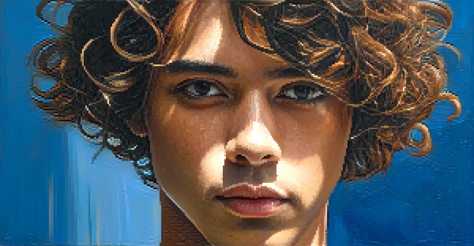
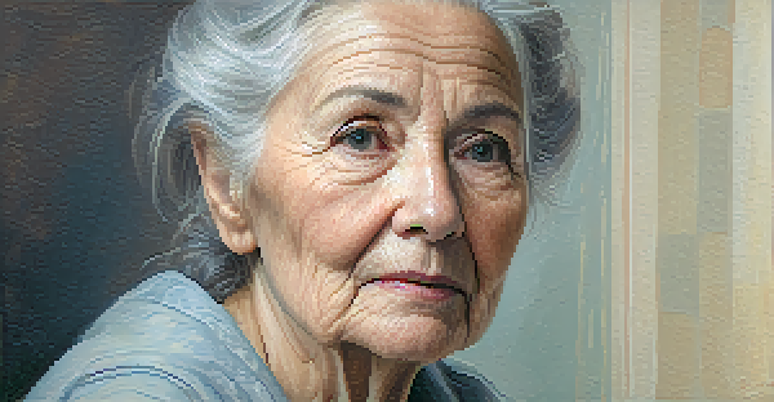
Complementary colors, which are opposite each other on the color wheel, can create dynamic contrasts that draw attention to specific features in a portrait. For instance, pairing a warm skin tone with a cool background can highlight the subject's face beautifully. This technique can make portraits more striking and engaging.
Color Shapes Emotion in Portraits
The choice of color in portrait painting is essential for conveying the subject's emotions and personality.
Additionally, understanding the use of analogous colors—those that sit next to each other on the color wheel—can help achieve a more subtle and harmonious effect. By combining these colors effectively, an artist can create depth and dimension, enhancing the overall realism of their portraits.
Skin Tones: Mixing Colors for Realism
Capturing realistic skin tones is one of the most challenging aspects of portrait painting. Artists often start with a basic palette that includes primary colors, white, and a touch of black. By mixing these colors in varying proportions, they can create a wide range of skin tones that reflect the subject's unique complexion.
The colors live a remarkable life of their own after they have been applied to the canvas.
It's essential to remember that skin tones are not flat; they contain a variety of undertones, such as red, yellow, and blue. Observing the nuances in a subject's skin can help artists mix more accurate shades. For example, someone with a warm undertone might require more yellow or peach hues, while cooler undertones may involve more blue or violet tones.
By experimenting with color mixing and layering techniques, artists can achieve a sense of depth and realism in their portraits. This attention to detail can transform a simple painting into a lifelike representation of the subject, allowing viewers to connect on a more personal level.
Lighting Effects: How They Influence Color
Lighting is a crucial factor that influences how colors appear in a portrait. Natural light, for instance, can cast warm or cool tones depending on the time of day. Artists need to observe how light interacts with their subject's skin and clothing to accurately represent those colors on canvas.
The direction of the light source also affects shadows and highlights, creating depth and dimension in the portrait. Artists can use this to their advantage by strategically placing shadows to enhance facial features. For example, a light source from above can create soft shadows under the chin, adding realism to the depiction.
Mastering Color Theory is Crucial
Understanding color theory, including complementary and analogous colors, helps artists create visually appealing and balanced portraits.
Understanding how lighting affects color perception allows artists to make informed choices when painting. By mimicking these effects, they can create portraits that are not only visually striking but also believable, capturing the true essence of their subjects.
Brush Techniques for Color Application
The way color is applied can significantly impact the overall feel of a portrait. Different brush techniques, such as layering, glazing, or stippling, can create various textures and effects. For instance, layering involves building up translucent colors to achieve a luminous quality, perfect for capturing the glow of skin.
Glazing, on the other hand, is a technique where thin, transparent layers of color are applied over dried paint. This method allows for rich color depth and complexity, enhancing the portrait's vibrancy. Artists often use glazing to adjust tones and add subtle nuances that might be difficult to achieve with direct painting.
By experimenting with these techniques, portrait artists can find their unique style and approach to color application. The right technique can elevate a painting from ordinary to extraordinary, showcasing the artist's skill and vision.
Using Color to Convey Emotion in Portraits
Color can be a powerful tool for conveying emotion in portrait painting. Different colors evoke different feelings, and artists can use this to their advantage. For example, an artist might choose a muted palette for a somber portrait, while brighter colors could reflect joy or vitality.
Moreover, the placement and intensity of colors can further enhance emotional expression. A bold splash of red might symbolize passion or anger, while soft pastels could convey tenderness and peace. By thoughtfully selecting and applying colors, artists can guide viewers through the emotional landscape of their work.
Lighting Impacts Color Perception
Lighting conditions significantly influence how colors appear, affecting the overall realism and depth of the portrait.
Ultimately, using color effectively in portrait painting allows artists to explore and express complex emotions. This emotional connection can resonate with viewers, making the portrait not just a likeness but a representation of the subject's inner world.
Practicing Color Techniques: Tips for Artists
For aspiring portrait painters, practice is key to mastering color techniques. One effective way to improve is by studying the works of renowned artists who skillfully use color. Analyzing their choices can provide insights into how to approach color mixing and application.
Additionally, artists can set up still-life arrangements or work from photographs to practice different lighting conditions and skin tones. Experimenting with various palettes and techniques in these controlled settings can build confidence and refine skills. It's like going to the gym for your painting muscles!
Lastly, don’t shy away from making mistakes; they are part of the learning process. Each error can lead to new discoveries in color application and help develop a personal style. With patience and persistence, artists can evolve and enhance their portrait painting abilities through the exploration of color.