Exploring Color Theory Through Still Life Composition
What is Color Theory and Why Does it Matter?
Color theory is a set of principles that explains how colors interact and influence each other. Understanding these principles is crucial for artists, as it helps them create visually appealing compositions. By mastering color theory, artists can evoke emotions, set moods, and guide viewers' eyes through their artwork.
Color is the keyboard, the eyes are the harmonies, the soul is the piano with many strings.
For instance, consider the difference between warm and cool colors. Warm colors like reds and yellows can create a sense of energy and excitement, while cool colors like blues and greens often evoke calmness and serenity. Knowing how to use these colors effectively can dramatically change the impact of a still life piece.
Ultimately, color theory serves as a foundational tool for artists, allowing them to communicate their ideas more effectively and connect with their audience on a deeper level.
The Role of Color in Still Life Compositions
In still life art, color plays a pivotal role in establishing the composition's overall theme and mood. Artists choose their color palette carefully to ensure cohesion and harmony among the objects depicted. This intentional selection can transform a simple arrangement of items into a captivating narrative.
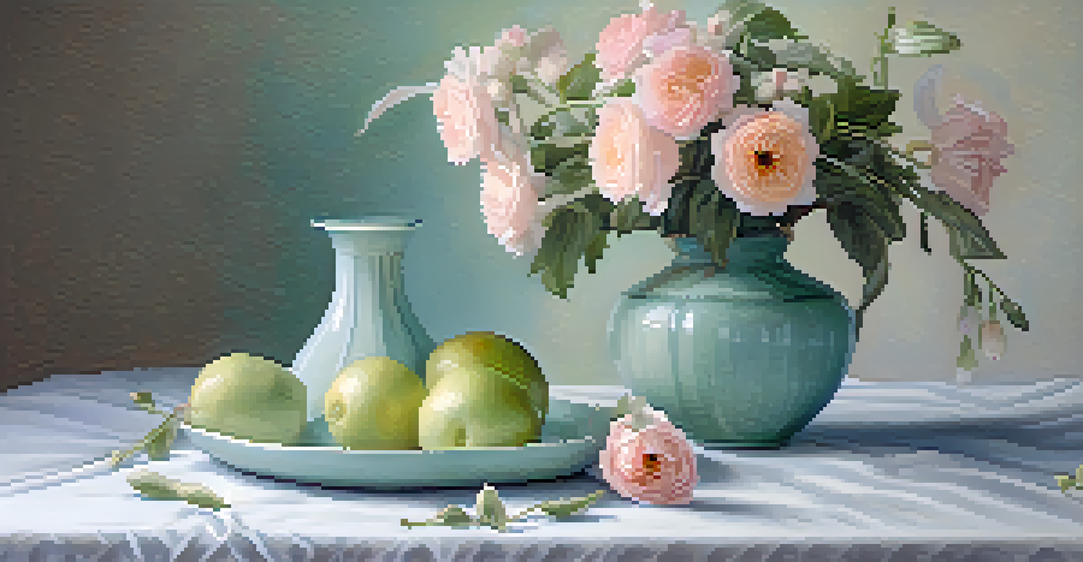
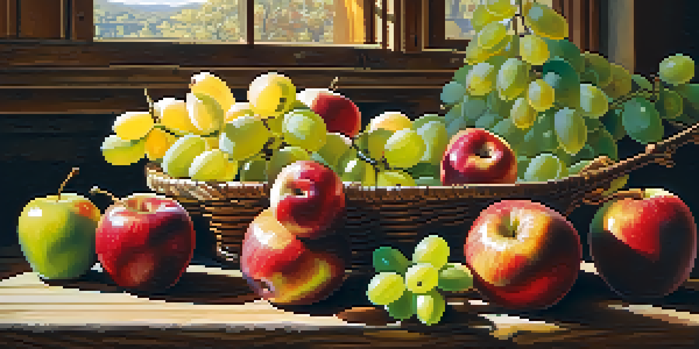
For example, a still life featuring vibrant fruits set against a dark background can create a striking contrast, drawing attention to the fruits’ colors and textures. Conversely, a softer palette with pastel hues can evoke a sense of nostalgia and tranquility, inviting viewers to linger over the details.
Importance of Color Theory
Color theory helps artists create visually appealing compositions and evoke emotions through their use of color.
By understanding how color influences the perception of a still life, artists can create compositions that resonate with viewers, making the artwork not just visually appealing, but also emotionally engaging.
Primary, Secondary, and Tertiary Colors Explained
At the heart of color theory are primary, secondary, and tertiary colors. Primary colors—red, blue, and yellow—cannot be created by mixing other colors. Secondary colors, like green, orange, and purple, are formed by mixing two primary colors. Tertiary colors result from mixing a primary color with a secondary color, creating a broad spectrum of hues.
Colors are the smiles of nature.
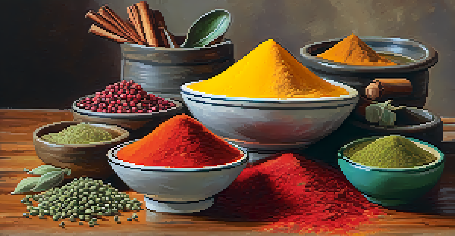
In still life compositions, the choice of primary, secondary, and tertiary colors can create various effects. For instance, using complementary colors—colors located opposite each other on the color wheel—can create vibrant contrasts that add depth and interest to the artwork.
This understanding enables artists to experiment with color combinations, enhancing their still life arrangements to evoke specific emotions or reactions from viewers.
Warm and Cool Colors: Creating Contrast and Mood
Warm colors, such as reds and oranges, tend to advance in a composition, making objects appear closer to the viewer. In contrast, cool colors, like blues and greens, recede, giving a sense of distance. This dynamic can be used strategically in still life compositions to create depth and visual interest.
For example, placing warm-colored fruits in the foreground can draw attention, while cool-colored objects in the background provide balance and context. This layering effect helps to guide the viewer's eye through the artwork, creating a more engaging experience.
Role of Color in Still Life
Color selection in still life compositions establishes mood and narrative, making the artwork emotionally engaging.
By skillfully using warm and cool colors, artists can enhance the narrative of their still life, effectively conveying emotions and themes through visual storytelling.
Color Harmony: Achieving Balance in Your Composition
Color harmony refers to the aesthetically pleasing arrangement of colors. Achieving harmony in still life compositions is essential for creating a cohesive look that resonates with viewers. Artists often use color schemes—such as monochromatic, analogous, or complementary—to establish this balance.
For instance, an analogous color scheme, which uses colors next to each other on the color wheel, can create a soothing effect in a still life. This can be particularly effective in depicting serene scenes, such as a quiet table setting with soft pastels.
By understanding and applying color harmony, artists can elevate their still life compositions, making them not only visually appealing but also emotionally impactful.
Symbolism of Colors: Conveying Deeper Meanings
Colors carry symbolism and can convey deeper meanings in art. For instance, red often symbolizes passion or love, while blue can represent calmness or sadness. Artists can use this symbolism to add layers of meaning to their still life compositions, inviting viewers to explore beyond the surface.
For example, including a single wilted flower among vibrant blooms can symbolize loss or the passage of time. This thoughtful use of color can transform a simple still life into a profound statement about life and its complexities.
Symbolism Enhances Artistic Depth
Colors can convey deeper meanings in art, allowing artists to create profound statements through their still life arrangements.
By being mindful of the symbolic meanings of colors, artists can create still life pieces that resonate on a personal level, encouraging viewers to engage with the artwork in a more meaningful way.
Experimenting with Color: Practical Tips for Artists
Experimentation is key in mastering color theory and applying it to still life compositions. Artists can start by creating color swatches or mixing paints to see how different colors interact. This hands-on approach helps in understanding how colors can change in various lighting conditions and contexts.
Another effective method is to create thumbnail sketches of still life arrangements with different color palettes. This allows artists to visualize their ideas before committing to a larger piece, making it easier to find the right balance and harmony.
Ultimately, the more artists experiment with color, the more confident they become in their choices, leading to more dynamic and engaging still life compositions.