Contrast and Harmony: Key Principles of Painting Composition

Understanding Contrast in Painting Composition
Contrast in painting refers to the use of opposing elements to create interest. Think of it like a musical duet where two different notes come together to form a harmonious yet striking sound. In visual arts, this can manifest through colors, shapes, and textures that stand apart from one another.
Contrast is the mother of all colors.
For example, pairing bright colors with dark shades can make certain elements pop, drawing the viewer's eye directly to your focal point. This technique can evoke emotions and add depth to the narrative you’re trying to convey through your artwork. Just like a well-timed pause in music, contrast can create tension and excitement.
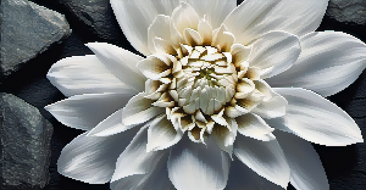
Furthermore, contrast isn't just about color; it can also relate to size, shape, and even the subject matter. When you juxtapose a delicate flower against a rough stone background, you create a visual dialogue that encourages viewers to ponder the relationship between the two. This dynamic interplay is what makes contrast an essential principle of effective composition.
The Role of Harmony in Artistic Composition
While contrast brings energy and excitement, harmony provides balance and cohesion in a painting. It's like a perfectly blended smoothie, where different fruits come together to create a deliciously smooth flavor. In art, harmony can be achieved through the careful selection of colors, shapes, and patterns that complement each other.
For instance, using a monochromatic color scheme can enhance harmony by limiting the palette to varying shades of a single hue. This creates a serene atmosphere that invites the viewer to immerse themselves in the artwork. In contrast to the jarring effects of stark contrast, harmony soothes the senses and fosters a sense of peace.
Contrast Adds Interest to Art
Using opposing elements like colors and textures creates visual intrigue and draws attention to focal points in a painting.
Moreover, harmony can also be found in the relationships between objects within the composition. By ensuring that each element feels connected, whether through similar textures or recurring motifs, artists can guide viewers through the narrative of the painting. This sense of unity enriches the overall experience and leaves a lasting impression.
Balancing Contrast and Harmony for Impact
Striking the right balance between contrast and harmony is crucial for creating impactful compositions. Think of it as walking a tightrope: too much contrast can overwhelm, while too little can lead to monotony. A balanced composition draws the viewer's eye while maintaining a sense of visual unity.
Art is the most beautiful of all lies.
For example, an artist might use bold colors to highlight specific areas of a painting while keeping the surrounding elements harmonized with softer tones. This interplay not only attracts attention but also guides the viewer's journey through the artwork. A thoughtful balance ensures that no single element overshadows the others.
This balance can also be achieved through the distribution of visual weight. Placing contrasting elements strategically within the composition can create a sense of equilibrium that enhances the overall aesthetic. By mastering this balance, artists can elevate their work from mere decoration to a captivating visual experience.
Using Color Contrast to Create Emotion
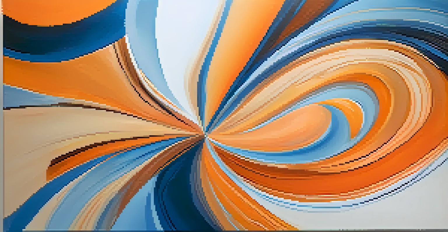
Color is a powerful tool in the artist's toolkit, especially when it comes to contrast. Bright, vibrant colors can evoke feelings of joy and energy, while muted tones can instill calmness or melancholy. By leveraging these emotional responses, artists can enhance the storytelling aspect of their work.
For instance, a fiery red against a cool blue can symbolize conflict or passion, instantly communicating emotions without the need for words. This emotional contrast invites viewers to engage with the artwork on a deeper level, prompting them to reflect on their own feelings and experiences. It’s like the difference between a thrilling climax and a gentle resolution in a good story.
Harmony Provides Visual Balance
Achieving harmony through complementary elements ensures a cohesive composition that invites viewers to engage with the artwork.
Moreover, color contrast can also influence the viewer's focus. A strategically placed splash of color can serve as a visual anchor, directing attention to the most critical elements of the piece. This thoughtful application of color ensures that the emotional narrative unfolds seamlessly, allowing viewers to connect more profoundly with the artwork.
Texture and Contrast: Adding Depth to Your Art
Texture is another way to explore contrast in your painting. Just as a well-prepared dish has various textures that enhance its flavor, combining different textures in art can add layers of interest. This can involve using rough brush strokes alongside smooth surfaces to create a dynamic visual experience.
For example, in a landscape painting, the roughness of tree bark can contrast beautifully with the soft, flowing lines of a river. This not only provides visual interest but also invites the viewer to contemplate the natural world in a more nuanced way. Texture can evoke tactile sensations, making the artwork feel more alive.
Additionally, contrasting textures can guide the viewer's eye across the canvas, creating a sense of movement and flow. This interplay encourages exploration, inviting viewers to discover new details with each glance. By thoughtfully incorporating texture, artists can enhance the depth and complexity of their compositions.
Creating Focal Points Through Contrast
Focal points are vital in painting, directing the viewer's attention to the most important parts of the artwork. Contrast serves as a powerful tool in establishing these focal points, allowing certain elements to stand out boldly against a more subdued background. This technique can help convey the central message or theme of the piece.
For instance, imagine a serene landscape where a vibrant red barn stands out against a muted green field. The barn becomes the focal point, drawing viewers in and encouraging them to explore its details. This kind of contrast not only highlights the subject but also adds narrative depth to the artwork.
Experimentation Fuels Artistic Growth
Exploring various combinations of contrast and harmony can lead to unexpected discoveries and enhance overall creativity in art.
Additionally, creating contrast through size can also emphasize focal points. A small figure amidst a vast landscape can evoke feelings of isolation or adventure, depending on how it’s portrayed. This intentional use of contrast shapes the viewer's experience and interpretation, making the artwork more engaging.
The Importance of Experimentation in Composition
Experimentation is a crucial part of mastering contrast and harmony in painting. Just as a musician practices different notes and rhythms, artists should feel free to explore various combinations of contrasting and harmonious elements. This process often leads to unexpected yet rewarding discoveries.
For example, trying out different color palettes or playing with varying brush techniques can yield unique results that enhance the overall composition. Even the slightest change can shift the balance of contrast and harmony, opening new avenues for creativity. Embracing the unexpected can often lead to breakthroughs in artistic expression.
Moreover, sharing your work with others can provide valuable feedback and insights. Engaging with fellow artists or art enthusiasts can inspire fresh ideas and perspectives. This collaborative spirit fosters growth and encourages continuous learning, ultimately enriching your artistic journey.