How Color Theory Affects Composition in Art and Painting
What is Color Theory and Its Importance in Art?
Color theory is a framework that explains how colors interact with each other. It encompasses the color wheel, color harmony, and the psychological effects of colors. Understanding this theory is essential for artists as it influences how viewers perceive their work.
Color is the keyboard, the eyes are the harmonies, the soul is the piano with many strings.
By mastering color theory, artists can evoke emotions and establish mood through their compositions. For instance, warm colors like red and yellow can create excitement, while cool colors like blue and green can convey calmness. This emotional response plays a crucial role in engaging the audience.
Ultimately, color theory serves as a guiding principle for artists, helping them make informed decisions about their palettes. This foundational knowledge can elevate their artwork, making it more compelling and cohesive.
How Color Relationships Affect Composition
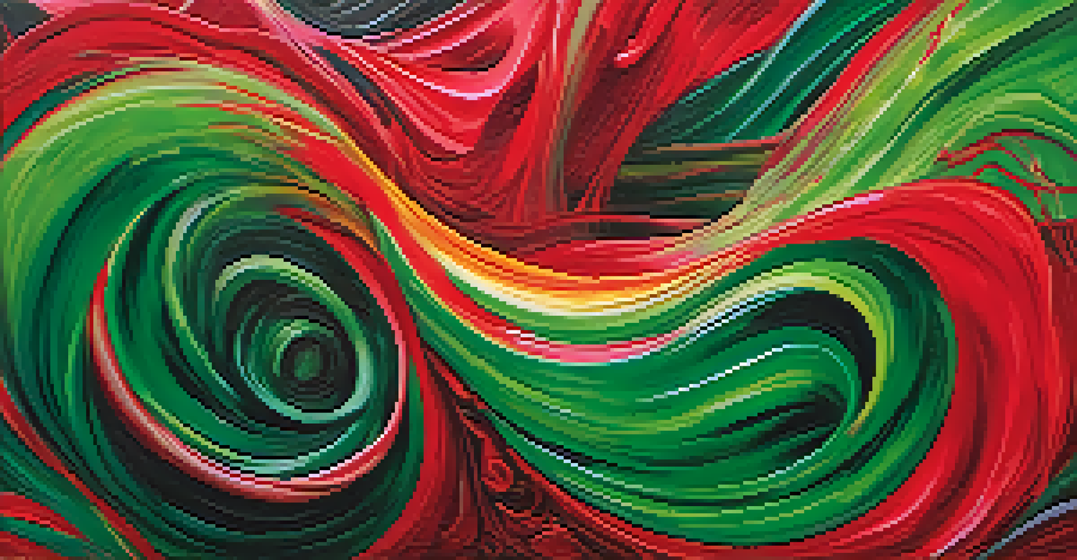
Color relationships are key to creating harmony in a composition. Artists often use complementary colors—those opposite each other on the color wheel—to create contrast and vibrancy. For example, a painting featuring blue and orange can draw the viewer's eye and make certain elements pop.
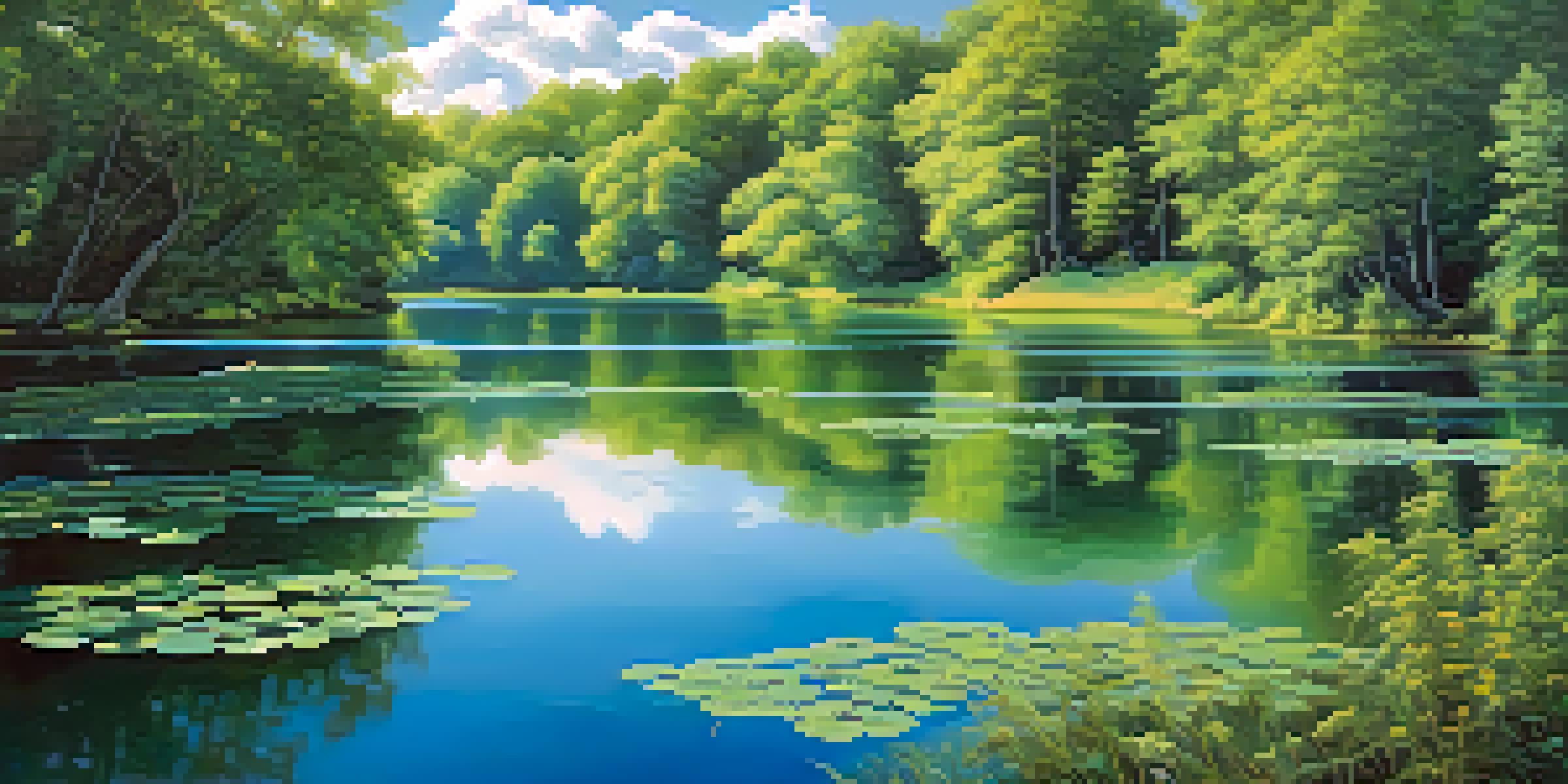
Additionally, analogous colors, which are next to each other on the wheel, promote a sense of unity. By using shades of green and blue, for instance, an artist can convey tranquility and a seamless flow throughout the piece. This balance can greatly enhance the overall composition.
Color Theory Guides Artistic Choices
Understanding color theory helps artists evoke emotions and create cohesive compositions.
Understanding these relationships allows artists to manipulate visual interest effectively. By strategically placing contrasting or harmonious colors, they can guide the viewer's gaze and create a more dynamic experience.
The Emotional Impact of Color in Art Composition
Color has a profound emotional impact on viewers, influencing their reaction to a piece of art. Warm colors often evoke feelings of passion and energy, while cool colors can induce calm and serenity. This emotional layer adds depth to a composition, making it more relatable.
Colors are the smiles of nature.
For instance, a landscape painting dominated by soft blues and greens may evoke feelings of peace and relaxation, while a vibrant sunset with reds and oranges can stir feelings of excitement or nostalgia. Artists use these emotional cues to connect with their audience on a deeper level.
By being intentional about color choices, artists can harness this emotional power to enhance their compositions. The right combination can transform a simple scene into a powerful narrative that resonates with viewers.
Using Color to Direct Focus in Composition
Artists often use color strategically to direct the viewer's focus within a composition. By employing bright or contrasting colors in specific areas, they can draw attention to the focal point of the artwork. This technique is essential in guiding the viewer's journey through the piece.
For example, if an artist wants to highlight a figure in a landscape, they might dress the figure in a striking red against a muted green background. This contrast not only emphasizes the subject but also creates a visual hierarchy within the composition.
Color Relationships Create Harmony
Using complementary and analogous colors enhances visual interest and unity in artwork.
Incorporating color this way can enhance storytelling within the artwork. It helps convey the artist's intended message and ensures that viewers engage with the most critical elements of the piece.
The Role of Light and Shadow in Color Composition
Light and shadow play a significant role in how colors are perceived in a composition. The interplay of light affects how colors appear, sometimes making them seem lighter or darker than they are. This dynamic can add depth and dimension to an artwork.
For instance, a bright sunlight scene may wash colors out, creating lighter tones, while a dimly lit environment can bring out deeper hues. Artists consider these effects when planning their compositions to ensure that the colors work harmoniously under various lighting conditions.
Understanding this relationship between light, shadow, and color helps artists create more realistic and compelling compositions. It allows them to manipulate visual perception and enhance the overall impact of their work.
Color Schemes: Techniques for Effective Composition
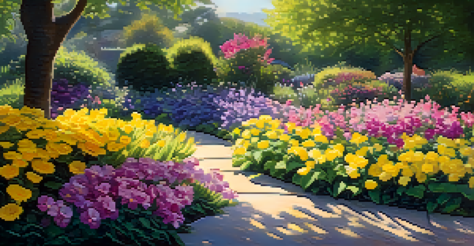
Color schemes are essential tools for artists, providing a structured approach to color selection in compositions. Popular schemes include monochromatic, complementary, and triadic colors, each offering different aesthetic qualities. For example, a monochromatic scheme can create a soothing and cohesive look.
Choosing a color scheme helps artists maintain consistency and balance in their work. A complementary color scheme, on the other hand, can introduce energy and vibrancy, making certain elements stand out. This strategic choice can significantly influence the overall mood and effectiveness of the composition.
Color Directs Viewer Focus
Strategically placing colors can guide the viewer's gaze and emphasize key elements in a composition.
By experimenting with different color schemes, artists can discover unique combinations that resonate with their vision. This exploration not only enhances their skills but also enriches their artistic expression.
Practical Tips for Applying Color Theory in Painting
Applying color theory in painting can seem daunting, but some practical tips can simplify the process. Start by experimenting with a limited palette to understand how colors interact. This can help you gain confidence in mixing and matching colors effectively.
Another helpful tip is to create color swatches before beginning your painting. This step allows you to visualize how various colors will look together, enabling more informed decisions as you work. Taking time to plan your palette can save you from potential clashes later on.
Lastly, don't hesitate to seek inspiration from other artists or nature. Observing how colors work in different contexts can spark creativity and encourage you to incorporate new ideas into your compositions.