Creating Tints, Shades, and Tones: Advanced Color Mixing
Understanding the Basics of Color Theory
Color theory is the foundation of any artistic endeavor, providing guidelines on how colors interact. At its core, it explains primary colors (red, blue, yellow), secondary colors (green, orange, purple), and tertiary colors, which are blends of these. This understanding is crucial as it sets the stage for more advanced mixing techniques.
Color is the keyboard, the eyes are the harmonies, the soul is the piano with many strings.
Using a color wheel can be incredibly helpful in visualizing relationships between colors, allowing artists to see complementary and analogous colors. For example, pairing blue with orange creates a vibrant contrast, while blue and green offer a soothing blend. Familiarizing yourself with these concepts will empower you to mix colors more effectively.
As you delve deeper into color mixing, you’ll find that creating tints, shades, and tones is pivotal to adding depth and interest to your artwork. These techniques expand your palette and can transform your artistic expression, leading to truly unique creations.
What Are Tints and How to Create Them?
Tints are created by adding white to a base color, resulting in lighter variations. For example, mixing white with red produces pink, a softer hue that can evoke different emotions compared to its vibrant counterpart. This technique is essential when you want to create highlights or a lighter mood in your compositions.
The beauty of tints lies in their versatility; they can be used to soften bold colors or create an airy feel in your artwork. Think about how a pastel palette can convey calmness, making it perfect for themes like spring or tranquility. Experimenting with different proportions of white will help you discover the exact tint you prefer.
Understanding Tints, Shades, and Tones
Tints, shades, and tones are essential techniques in color mixing that help create depth, mood, and dimension in artwork.
Remember, tints are not just about making colors lighter; they can add dimension and depth to your work. By understanding how to create and utilize tints effectively, you’ll expand your creative toolkit, allowing for richer storytelling through color.
Exploring Shades: Darkening Your Colors
Shades are the counterpart to tints; they are created by adding black to a base color, resulting in deeper, darker variations. For instance, adding black to blue gives you navy, a color often associated with elegance and sophistication. Shades can introduce a dramatic flair, perfect for creating contrast in your artwork.
Colors are the smiles of nature.
When working with shades, it’s important to be cautious, as adding too much black can easily overpower the original color. A little goes a long way, so start with small amounts and gradually increase until you achieve the desired depth. This experimentation can lead to stunning effects that elevate your pieces.
Using shades effectively can change the mood of your artwork significantly. Darker colors can evoke feelings of mystery or seriousness, while lighter tints might convey joy or lightness. Understanding how to balance these elements will improve your overall composition and impact.
The Role of Tones in Color Mixing
Tones are created by adding gray (a mixture of black and white) to a color, effectively balancing its intensity and creating more muted versions. For example, mixing gray with red results in a dusty rose, which can feel more sophisticated than vibrant red. This technique is particularly useful for achieving realism in landscapes or portraits.
Tones allow artists to explore subtle nuances in their work, making them perfect for creating depth and texture. Consider how a toned palette can evoke the feeling of fog or twilight, lending an atmospheric quality to your pieces. It’s the subtlety of tones that often makes artwork truly captivating.
Practical Mixing Applications
Experimenting with tints, shades, and tones can enhance various artistic works, such as landscapes or digital graphics, by adding storytelling elements.
Incorporating tones into your color mixing repertoire can help you develop a more mature understanding of color relationships. This approach not only enhances your artistic skills but also allows for greater flexibility in expressing your ideas visually.
Practical Applications: Using Tints, Shades, and Tones
Now that you understand the concepts of tints, shades, and tones, it's time to put them into practice. Whether you're painting a landscape or designing a digital graphic, these techniques can enhance your work dramatically. Start with a basic color palette and experiment by mixing in white, black, or gray to see how the colors transform.
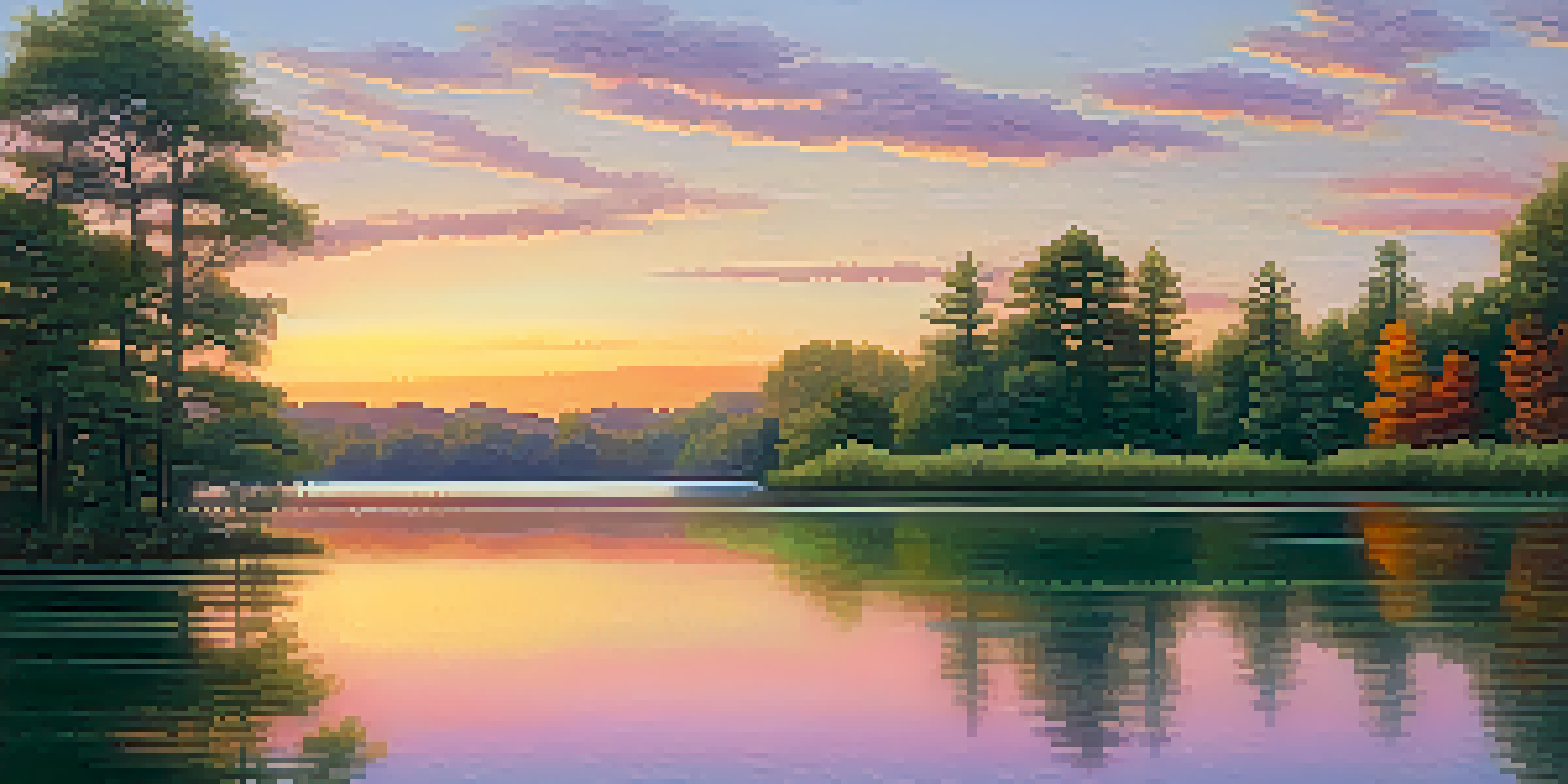
For instance, if you're creating a sunset scene, using various tints and shades of orange and yellow can depict the light as it fades, while deeper shades of blue can represent the encroaching night. This interplay of colors can add a layer of storytelling to your artwork, making it more engaging for viewers.
Remember, the key to mastering these techniques lies in practice and experimentation. Don’t hesitate to play around with different combinations, and observe how they affect the overall mood and message of your art. Each piece you create is an opportunity to learn and refine your skills.
Common Mistakes to Avoid in Color Mixing
When it comes to mixing colors, there are a few common pitfalls artists often encounter. One mistake is using too much black when creating shades, which can lead to muddy colors. Instead, aim for subtlety; start with a base color and gradually add black until you reach a pleasing depth.
Another frequent error is neglecting to test your mixtures. Always try out your tints, shades, and tones on a separate palette before applying them to your artwork. This practice can save you from unexpected surprises and help you refine your color choices.
Common Mistakes to Avoid
Artists should be cautious of common pitfalls in color mixing, like overusing black and neglecting to test mixtures, to achieve desired results.
Finally, remember that color mixing is an iterative process. Don’t be afraid to make adjustments or even start over if something isn’t working. Embracing experimentation will lead you to discover unique color combinations that resonate with your artistic voice.
Tips for Developing Your Color Mixing Skills
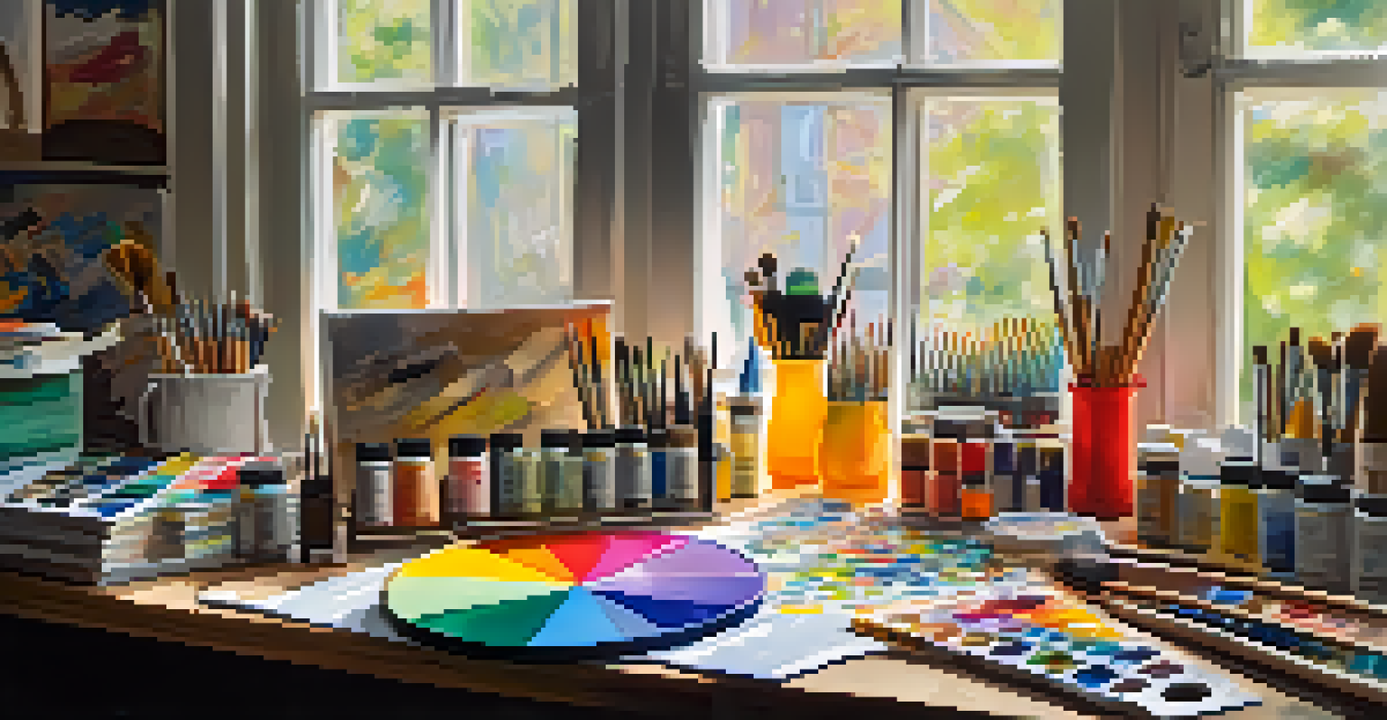
To enhance your color mixing abilities, begin by creating a color wheel using the primary colors. This exercise will not only help you visualize color relationships but also reinforce your understanding of how to mix colors effectively. As you create secondary and tertiary colors, take notes on the ratios you use; this can serve as a valuable reference in the future.
Another effective tip is to keep a color journal where you document your mixing experiments. Jot down the colors you mix, the proportions used, and the outcomes. This practice will help you track your progress and discover new color combinations you may want to replicate later.
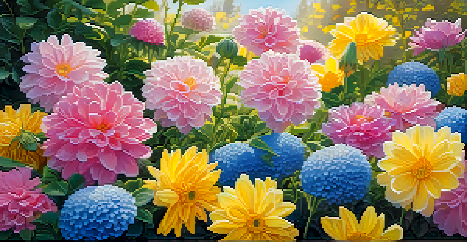
Lastly, don’t forget to seek inspiration from the world around you. Nature is filled with beautiful color combinations, and observing them can spark ideas for your own work. Whether it’s a vibrant sunset or a tranquil forest scene, let these experiences guide your color mixing journey.