Practical Techniques for Mixing Colors on Your Palette
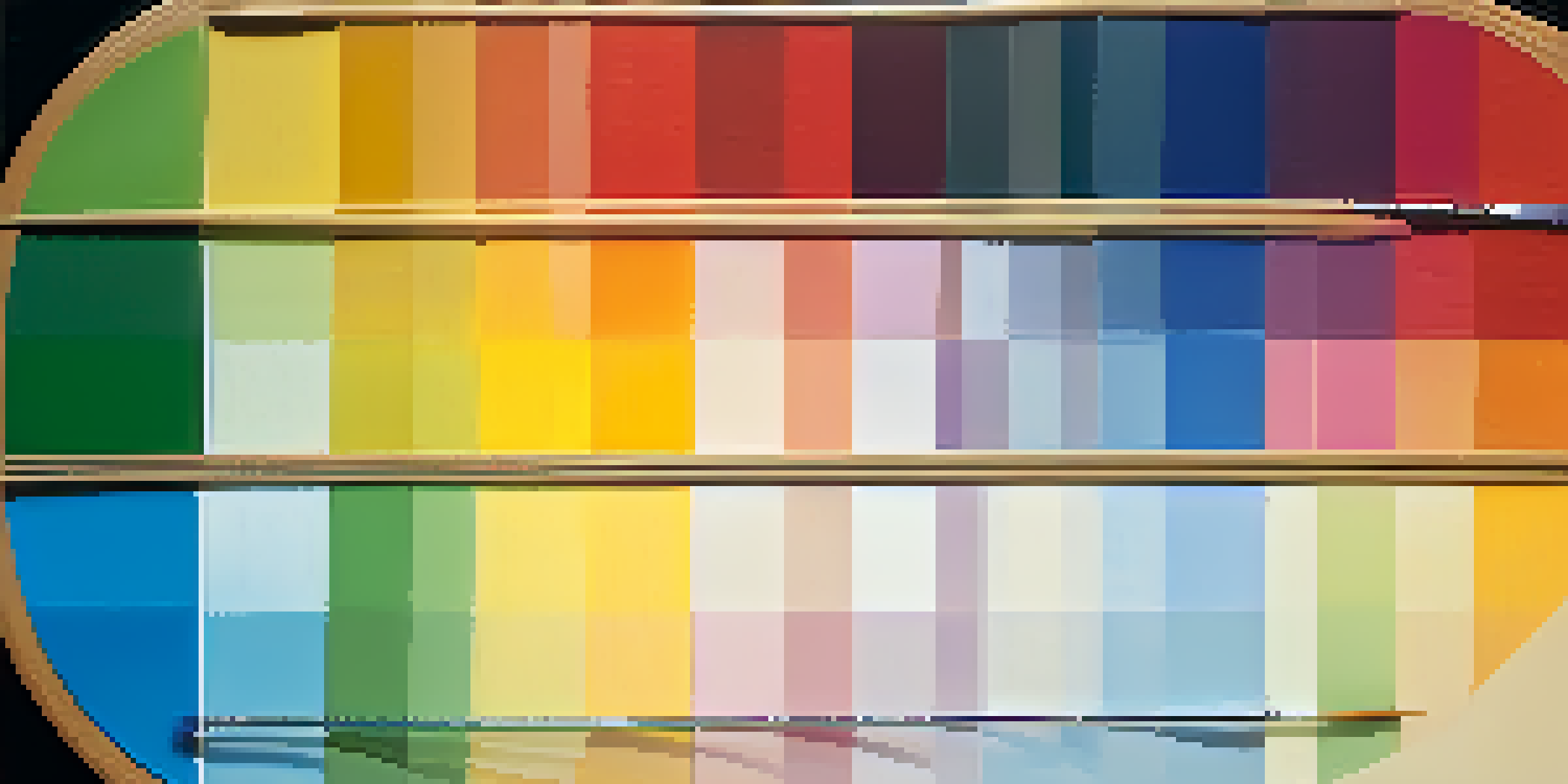
Understanding the Color Wheel: Your Mixing Guide
The color wheel is a fundamental tool for artists, showcasing how colors relate to each other. By understanding primary, secondary, and tertiary colors, you can predict how mixing them will result in new hues. For instance, mixing blue and yellow creates green, a fact that’s simple yet powerful in your creative process.
Color is the keyboard, the eyes are the harmonies, the soul is the piano with many strings.
Using the color wheel as a reference can help you choose complementary colors that will enhance your artwork. Complementary colors are opposite each other on the wheel, and when used together, they create vibrant contrasts. This technique can add depth and interest to your paintings, making them more visually appealing.
Additionally, experimenting with different shades and tints of colors can lead to unexpected and beautiful outcomes. For example, adding white to red creates pink, while adding black deepens the color to a rich burgundy. Embracing these variations can greatly expand your palette and artistic expression.
The Importance of Color Mixing Ratios
When mixing colors, the ratio can significantly impact the final shade. A small amount of one color added to a larger amount of another can create subtle variations. For example, if you mix a drop of blue into a generous amount of yellow, you'll get a soft green, whereas more blue will yield a more vibrant green.
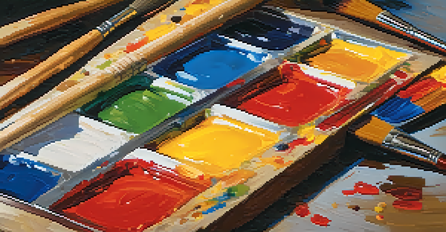
To achieve the desired result, it’s wise to work with a palette knife or brush to mix colors thoroughly. This ensures an even distribution, preventing patches of color from appearing in your work. Think of it as blending ingredients in a recipe; consistency is key to a delicious outcome.
Master Color Mixing Techniques
Understanding the color wheel and mixing ratios is essential for creating vibrant and harmonious artworks.
Don’t hesitate to keep a record of your ratios for future reference. Jotting down how much of each color you used can help you replicate successful mixes or avoid past mistakes. This practice not only builds your confidence but also refines your mixing skills over time.
Exploring Analogous Colors for Harmony
Analogous colors are those that sit next to each other on the color wheel, such as blue, blue-green, and green. Mixing these colors can create a sense of harmony in your artwork, making it pleasing to the eye. They naturally blend well and can evoke specific moods or themes.
The best artist has no conception that a marble block does not contain within itself; he merely frees it.
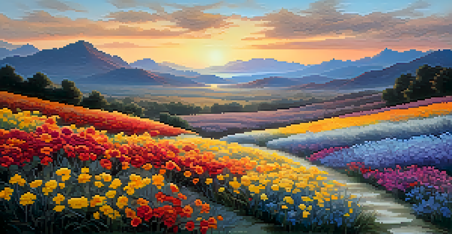
Consider using analogous colors when you want to create a serene landscape or a calm portrait. For instance, a painting of a sunset might use yellow, orange, and red, allowing each color to flow into the next seamlessly. This technique can also help in achieving a cohesive look throughout your piece.
As you experiment with analogous colors, don’t forget to introduce a neutral tone, like gray or beige, to balance the vibrancy. This can help prevent your palette from becoming overwhelming. Think of it as adding a pinch of salt to enhance the flavors in a dish—just the right amount can elevate the overall effect.
Creating Depth with Warm and Cool Colors
Understanding warm and cool colors is essential for adding depth to your artwork. Warm colors, like red, orange, and yellow, tend to advance in a composition, while cool colors, such as blue, green, and purple, recede. This principle can be used to create a sense of space and dimension in your paintings.
For example, if you're painting a landscape, you might use warm colors for the foreground elements, like flowers or sunlit areas, and cool colors for distant mountains or shadows. This contrast not only guides the viewer's eye but also adds a level of realism to your work.
Embrace Experimentation
Allowing yourself the freedom to experiment with colors can lead to unexpected and innovative artistic outcomes.
Experimenting with warm and cool color combinations can lead to striking results. Mixing a warm shade with a cool one can create an interesting balance, drawing attention to specific areas of your painting. Think of it as orchestrating a symphony; each color contributes to a harmonious whole.
Using a Limited Palette for Enhanced Focus
Working with a limited palette can be a powerful technique to elevate your art. By selecting just a few colors, you can create a more cohesive look and focus on mastering the mixing process. This approach encourages creativity while simplifying decision-making.
For instance, using only primary colors—red, blue, and yellow—can lead to a surprising range of hues. You’ll discover countless possibilities by mixing these three colors, which can enhance your understanding of color theory and improve your skills.
Moreover, a limited palette can also evoke strong emotions and themes. Think of the iconic blue period of Picasso, where the limited use of blue created a profound sense of melancholy. This technique can help you convey your artistic vision more clearly and effectively.
The Role of Experimentation in Color Mixing
One of the most enjoyable aspects of color mixing is the freedom to experiment. Allowing yourself to play with colors without the pressure of a finished piece can lead to exciting discoveries. Like a scientist in a lab, mixing colors can result in unexpected and delightful outcomes.
For example, try mixing colors that you wouldn’t typically pair together. You might find that a muddy brown can transform into a stunning earth tone when mixed thoughtfully. This kind of creative exploration can breathe new life into your work and push the boundaries of your artistic style.
Use a Limited Palette
Working with a limited color palette can enhance focus and help convey emotions more effectively in your art.
Don’t be afraid to make mistakes during your experiments; they can often lead to the most innovative results. Keep a sketchbook dedicated to your color experiments, documenting your findings and reflecting on what works. This practice not only builds your confidence but also enriches your artistic journey.
Practical Tips for Mixing Colors on Your Palette
To make your color mixing process easier, keep some practical tips in mind. First, always start with a clean palette to avoid unwanted contamination of colors. A simple wipe with a cloth or using a dedicated palette can help maintain clarity in your mixing.
Consider using a palette that suits your medium—whether it’s oil, acrylic, or watercolor—as each may require different types of surfaces. For instance, a stay-wet palette is ideal for acrylics, helping to keep your colors moist longer, while a glass palette can be great for oil paints.
Lastly, don't rush the mixing process. Give yourself time to explore and develop your colors fully. Just as a fine wine benefits from aging, your colors can achieve greater depth and richness with patience and careful blending.