The Basics of Color Mixing: Understanding Primary and Secondary Colors
What Are Primary Colors and Why Are They Important?
Primary colors are the foundation of all other colors. In traditional color theory, these are red, blue, and yellow. They cannot be created by mixing other colors, which makes them unique and crucial for artists and designers alike.
Color is the keyboard, the eyes are the harmonies, the soul is the piano with many strings.
Understanding primary colors is essential because they serve as the building blocks for creating a wide array of hues. When you grasp how these colors work individually, you can begin to explore the countless combinations they can produce.
Think of primary colors as the ingredients in a recipe. Just like how you can create a delicious dish with the right combination of basic ingredients, you can create vibrant artwork by mixing primary colors in various ways.
The Role of Secondary Colors in Color Mixing
Secondary colors are formed by mixing two primary colors in equal parts. For instance, mixing red and blue gives you purple, blue and yellow create green, and red and yellow result in orange. These colors expand your palette and enhance your creative possibilities.
By understanding secondary colors, you can start to see how color relationships work. They provide more depth and variety, allowing you to express different moods and themes in your art or design projects.
Primary Colors Are Essential
Primary colors serve as the fundamental building blocks for creating a wide range of hues in art and design.
Imagine painting a sunset: you might use orange and purple to capture the beauty of the sky. Knowing how to mix these secondary colors with primary ones can help you achieve that breathtaking effect.
Mixing Colors: The Science Behind It
Color mixing is not just an art; there's a science to it as well. When colors are mixed, they can create new wavelengths of light, which our eyes perceive as different colors. This phenomenon is primarily based on the additive and subtractive color mixing principles.
Colors are the smiles of nature.
Additive mixing occurs when light colors are combined, such as on a computer screen. In contrast, subtractive mixing happens with pigments, like paint, where colors absorb certain wavelengths and reflect others. Understanding these principles can help you make informed choices in your color mixing endeavors.
Think of it like blending different flavors in a smoothie. The way you combine those flavors will determine the overall taste. Similarly, the way you mix colors will shape the final hue and how it interacts with light.
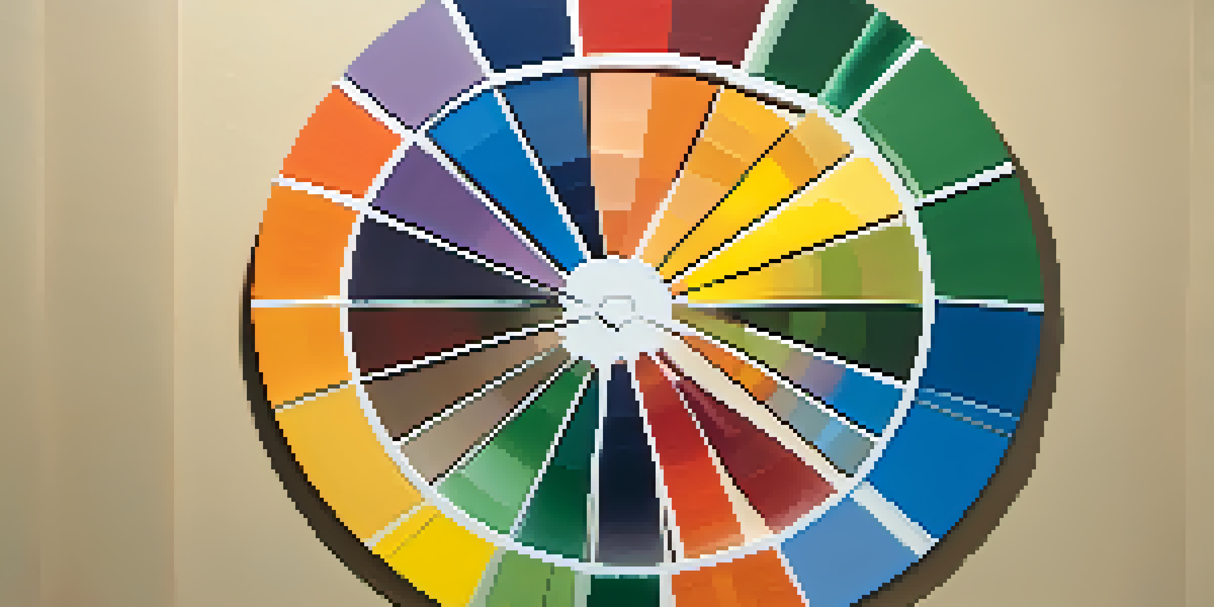
The Color Wheel: A Handy Tool for Color Mixing
The color wheel is a visual representation of colors arranged in a circular format. It typically includes primary, secondary, and tertiary colors, helping artists and designers understand how colors relate to one another. Using a color wheel can simplify the process of color mixing.
When you look at the color wheel, you can see complementary colors, which are opposite each other, and analogous colors, which are next to each other. This provides a quick reference for creating color harmony in your work.
Color Mixing Involves Science
Understanding the principles of additive and subtractive color mixing can enhance your ability to create visually appealing artworks.
Think of the color wheel as your color mixing roadmap. It guides you on your journey to create striking and appealing color combinations, just like a map helps you navigate to your destination.
Exploring Tertiary Colors: The Next Level
Tertiary colors are created by mixing a primary color with a secondary color. For example, mixing red (a primary) with orange (a secondary) results in red-orange. These colors add even more complexity and nuance to your palette.
Understanding tertiary colors allows you to create more sophisticated and refined artworks. They help you convey emotions and themes more effectively, making your work resonate with viewers.
Consider how a painter might use a variety of red-orange shades to depict a sunset. These subtle variations can evoke different feelings and enhance the overall impact of the piece.
The Emotional Impact of Color Combinations
Colors can evoke emotions and set the tone for your artwork or design. For instance, warm colors like red and yellow can create feelings of warmth and happiness, while cool colors like blue and green often evoke calmness and tranquility.
When mixing colors, think about the emotional response you want to elicit. Experimenting with different combinations can lead to surprising results that enhance the viewer's experience.
Emotions Influenced by Color
Color combinations can evoke specific emotions and set the overall tone of your artwork or design.
Imagine walking into a room painted in shades of blue and green—it might feel refreshing and serene, while a room with bright reds and yellows could feel energetic and lively. The power of color combinations is immense and can dramatically influence perceptions.
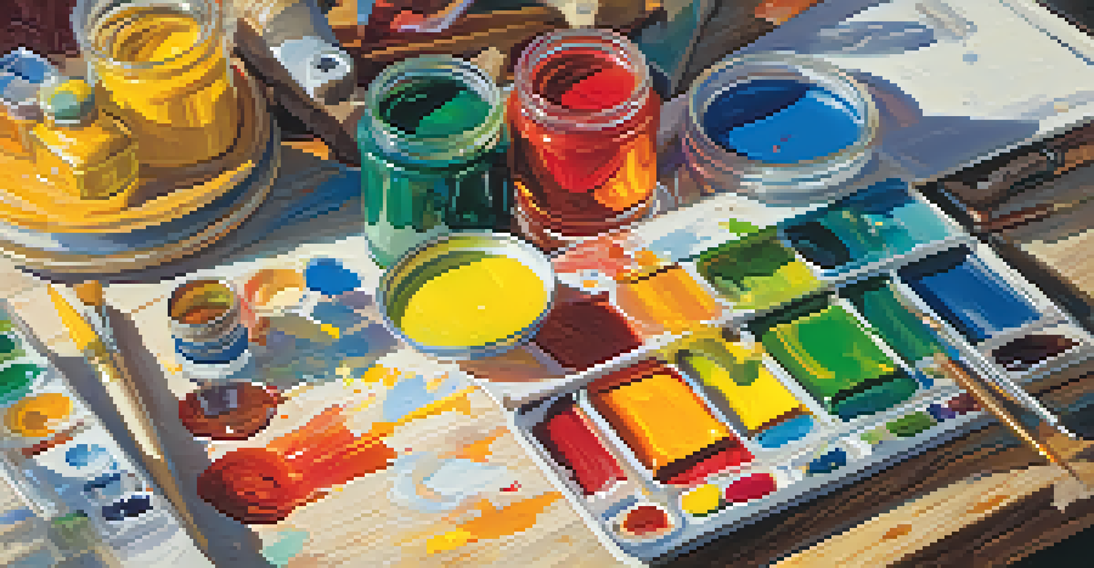
Practical Tips for Successful Color Mixing
To master color mixing, start with a basic set of primary colors and experiment! Use a palette to mix small amounts of paint and observe the results. Keep track of your mixtures, so you know how to replicate your favorite colors.
Don’t be afraid to make mistakes along the way. Color mixing is a learning process, and often the best discoveries come from unexpected combinations. Keep an open mind and let your creativity guide you.

Lastly, consider the context in which you'll be using the colors. Whether it’s for a painting, graphic design, or home decor, the lighting and surrounding elements can influence how colors appear. Test your mixtures in different settings to see their true nature.