The Color Wheel: A Tool for Mastering Color Mixing in Art
Understanding the Basics of the Color Wheel
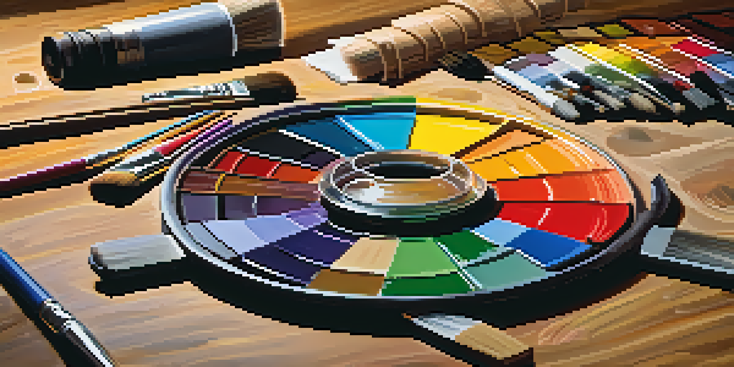
The color wheel is a circular diagram that represents colors arranged by their chromatic relationship. At first glance, it might seem like just a pretty picture, but it serves as a fundamental tool for artists. By visualizing colors in this way, you can grasp how they interact with one another, which is essential for effective color mixing in your artwork.
Color is the keyboard, the eyes are the harmonies, the soul is the piano with many strings.
Think of the color wheel as a map for your artistic journey. Just like a map helps you navigate new territories, the color wheel guides you through the landscape of color relationships. By understanding how primary colors blend into secondary and tertiary colors, you can make informed choices about your palette.
For example, mixing blue and yellow yields green, while red and blue create purple. This simple yet powerful concept of color blending opens up a world of possibilities in your art, allowing you to create depth, mood, and vibrancy in your pieces.
Primary, Secondary, and Tertiary Colors Explained
At the core of the color wheel are primary colors: red, yellow, and blue. These colors are unique because they cannot be created by mixing other colors together. They serve as the foundation for all other colors, making them crucial for any artist to understand.
Secondary colors, such as green, orange, and purple, are formed by mixing two primary colors. For instance, combining red and yellow results in orange. Tertiary colors, on the other hand, are created by mixing a primary color with a secondary color, creating shades like red-orange or blue-green.
Color Wheel Basics for Artists
Understanding the color wheel is essential for artists to visualize and mix colors effectively.
By recognizing these categories, you can expand your color vocabulary and improve your mixing techniques. This foundational knowledge will empower you to choose the right colors for your artwork, helping you express your creative vision more effectively.
Complementary Colors and Their Impact
Complementary colors are pairs that sit opposite each other on the color wheel. For instance, blue and orange or red and green are complementary pairs. When used together, these colors create a striking contrast that can make your artwork pop with vibrancy.
The best color in the whole world is the one that looks good on you.
Understanding complementary colors is key to adding depth and interest to your compositions. When placed side by side, they enhance each other's intensity, drawing the viewer's eye to focal points in your artwork. This technique is often used by artists to create visual tension and excitement.
For instance, if you paint a landscape with a vivid green tree against a bright red sunset, the contrast will not only catch attention but also evoke emotions. This dynamic interaction can elevate your art from ordinary to extraordinary, making it memorable.
Analogous Colors: Creating Harmony in Your Art
Analogous colors are groups of colors that sit next to each other on the color wheel, such as blue, blue-green, and green. These colors share a common hue, which makes them pleasing to the eye when used together. They create a sense of harmony and unity in your artwork.
Using analogous colors can help convey a specific mood or atmosphere. For example, a palette of warm colors like red, orange, and yellow can evoke feelings of warmth and energy, while cooler colors like blue, teal, and purple can create a calming effect.
Impact of Complementary Colors
Utilizing complementary colors can create striking contrasts that enhance the vibrancy and emotional depth of artwork.
Artists often utilize analogous color schemes to create smooth transitions in their work. This technique can be particularly effective in landscapes or portraits, where a cohesive color flow enhances the overall composition and aesthetic appeal.
Understanding Color Temperature: Warm vs. Cool
Colors can be categorized as warm or cool, a distinction that affects the mood and perception of your artwork. Warm colors, like reds, oranges, and yellows, evoke feelings of warmth and excitement, while cool colors, such as blues, greens, and purples, convey calmness and tranquility.
By understanding color temperature, you can create emotional resonance in your work. For example, a painting dominated by warm colors might feel energetic and lively, whereas one rich in cool colors may evoke serenity and reflection.
Mixing warm and cool colors strategically can also help create depth. Placing warm colors in the foreground and cool colors in the background can give your artwork a three-dimensional feel, guiding the viewer's eye through your composition.
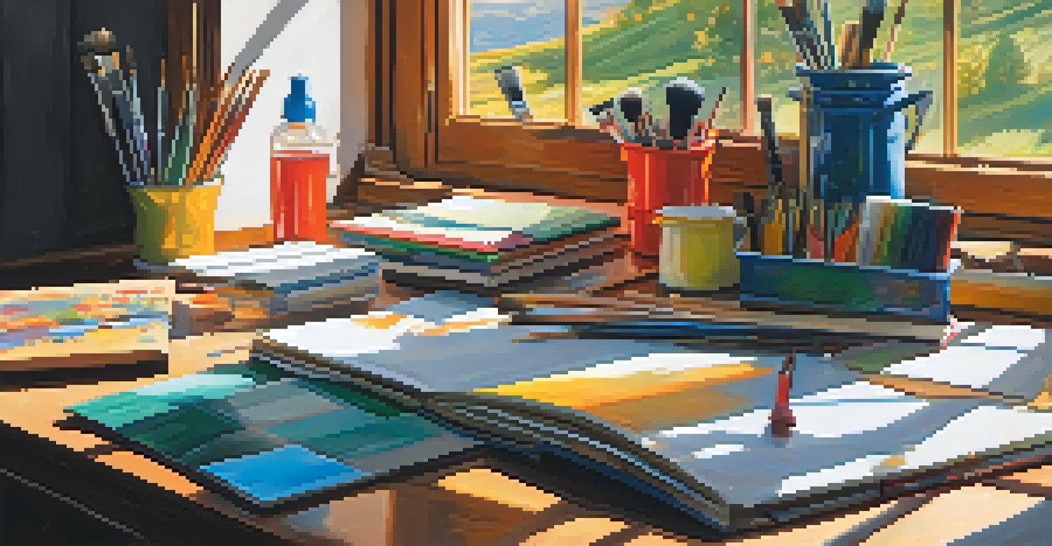
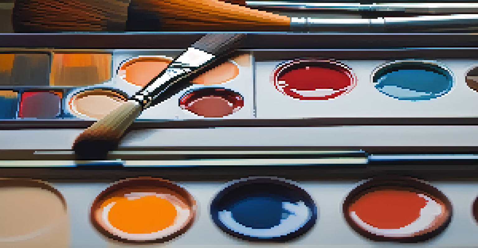
The Role of Color Mixing in Art Techniques
Color mixing is not just a skill; it's an art form in itself. Whether you're working with paints, pastels, or digital media, understanding how to mix colors effectively can drastically improve the quality of your work. It allows you to create a broader range of hues and tones, enriching your artistic palette.
Different techniques, such as layering, glazing, and wet-on-wet mixing, can be employed to achieve various effects. For instance, layering transparent colors can create depth and luminosity, while wet-on-wet mixing allows for smooth transitions between colors.
Mixing Techniques Enhance Art
Mastering various color mixing techniques can significantly improve the quality and range of hues in your art.
Experimenting with these techniques can lead to unique and unexpected results. Don’t be afraid to play around with your mixes; often, the most beautiful creations emerge from a willingness to explore and innovate.
Practical Tips for Using the Color Wheel Effectively
To harness the power of the color wheel, start by creating a color mixing chart. This chart allows you to visualize how different colors interact, helping you remember combinations for future projects. By keeping a record, you'll also build confidence in your mixing abilities.
Additionally, practice mixing colors in small batches to see how they blend. This hands-on approach will help you understand color properties like transparency, opacity, and saturation. Over time, you’ll develop an intuition for the colors that work best for your style.
Lastly, don’t forget to trust your instincts. While the color wheel provides a valuable framework, your personal artistic voice is just as important. Use the wheel as a guide, but always feel free to break the rules and explore colors that resonate with you.