The Psychology of Color: How Mixing Affects Perception
Introduction to Color Psychology and Its Importance
Color psychology explores how colors influence our emotions and behaviors. It plays a crucial role in design, marketing, and art, shaping how we perceive the world around us. For example, a vibrant red can evoke passion, while a calming blue may inspire tranquility.
Colors, like features, follow the changes of the emotions.
Understanding color psychology helps us make informed choices in various fields, from branding to interior design. Businesses often use specific colors to attract customers and create brand identity. This is why you'll often see fast-food chains using red and yellow, as these colors stimulate appetite and energy.
Ultimately, the right color choices can lead to increased engagement and emotional connection. By delving into how colors mix and affect perception, we can harness their power more effectively in our daily lives.
How Primary Colors Impact Our Emotions
Primary colors—red, blue, and yellow—serve as the foundation for all other colors. Each primary color carries distinct emotional connotations. For instance, red is often associated with love and excitement, while blue tends to evoke feelings of calmness and stability.

Understanding these emotional triggers can help us choose colors that align with the message we want to convey. For example, a company launching a new wellness product may opt for soothing blues and greens to promote relaxation. Meanwhile, a sports brand might favor bold reds and yellows to inspire energy and enthusiasm.
Colors Influence Emotions and Actions
Color psychology plays a vital role in design and marketing by affecting how we feel and behave.
Recognizing the emotional weight of primary colors allows us to utilize them more effectively in design and communication. The right primary color can create an immediate connection with an audience, making it a powerful tool in various applications.
The Role of Secondary Colors in Emotional Response
Secondary colors, formed by mixing primary colors, also carry strong emotional associations. For example, green, which is a mix of blue and yellow, often represents nature, growth, and balance. This makes it a popular choice for brands focused on sustainability and health.
Color is the keyboard, the eyes are the harmonies, the soul is the piano with many strings.
Moreover, purple, a blend of red and blue, is frequently linked to luxury and creativity. Brands aiming to convey sophistication might incorporate purple into their color schemes to attract a discerning audience. By understanding these associations, we can better tailor our color choices to resonate with our target demographic.
The emotional impact of secondary colors highlights the importance of mixing colors wisely. Each combination can create a unique feeling, making it essential to consider how these colors interact with one another in our designs.
Tertiary Colors: Nuances in Perception
Tertiary colors are created by mixing primary and secondary colors, resulting in a wide spectrum of hues. These colors add depth and nuance to our emotional responses. For instance, a color like teal, a mix of blue and green, can evoke feelings of sophistication and calmness.
Using tertiary colors in design can help create a more complex emotional landscape. A brand might choose a muted orange, which blends red and yellow, to convey warmth and friendliness without being overly aggressive. This subtlety can enhance the overall message and tone of the brand.
Cultural Context Shapes Color Meaning
Understanding cultural differences in color perception is essential for effective global communication and branding.
By incorporating tertiary colors thoughtfully, we can enrich our designs and create more sophisticated emotional connections. This attention to detail can elevate a brand’s visual identity and improve audience engagement.
Cultural Differences in Color Perception
Colors can carry different meanings across cultures, influencing how they are perceived globally. For example, while white is often associated with purity in Western cultures, it can represent mourning in some Asian cultures. This highlights the importance of cultural context in color selection.
Understanding these cultural differences is vital for businesses operating internationally. A marketing campaign that resonates in one country might offend or confuse audiences in another. By researching cultural color associations, brands can avoid missteps and connect more authentically with diverse audiences.
Ultimately, being aware of cultural differences in color perception allows for more respectful and effective communication. This cultural sensitivity can enhance a brand’s reputation and foster stronger relationships with global consumers.
The Science of Color Mixing: RGB and CMYK Models
Color mixing can be understood through two primary models: RGB and CMYK. RGB (Red, Green, Blue) is an additive color model used in digital screens, where colors are created by combining light. This model emphasizes how colors blend to create new shades, like mixing red and green to create yellow.
On the other hand, CMYK (Cyan, Magenta, Yellow, Key/Black) is a subtractive color model commonly used in printing. Here, colors are created by subtracting varying percentages of light absorbed by inks. Understanding these models is crucial for designers to ensure color accuracy across different mediums.
Color Mixing Enhances Design Impact
Mastering color mixing techniques allows designers to create emotional connections and improve visual identity.
By grasping the science behind color mixing, we can make smarter choices in our design processes. Whether working digitally or with print, knowing how colors interact helps us achieve the desired emotional and visual impact.
Practical Applications: Using Color Mixing in Design
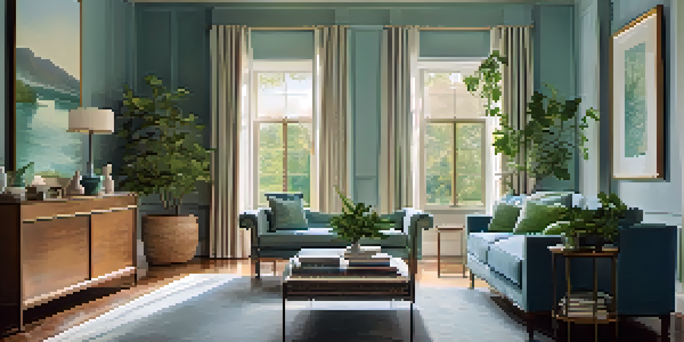
The knowledge of color psychology and mixing can be applied in various design contexts, from branding to interior decor. Designers can create mood boards that reflect the desired emotional response by strategically selecting colors. For example, a calm and inviting space might incorporate soft blues and greens to promote relaxation.
In branding, understanding how colors mix can enhance logo design and marketing materials. A tech company might combine sleek blue and gray tones to evoke trust and professionalism, while a children's brand might use bright, cheerful colors to convey playfulness and creativity.

By applying these principles of color mixing and psychology thoughtfully, designers can create compelling visual narratives. The right color combinations can significantly influence how a brand is perceived, making color a critical element in effective design.