Understanding Color Harmony: The Art of Mixing Colors
What is Color Harmony and Why It Matters
Color harmony refers to the pleasing arrangement of colors that create a sense of balance and aesthetic appeal. When colors work well together, they evoke emotions and can set the mood of a space or artwork. Understanding color harmony is essential for artists, designers, and anyone interested in creating beautiful visuals.
Color is the keyboard, the eyes are the harmonies, the soul is the piano with many strings.
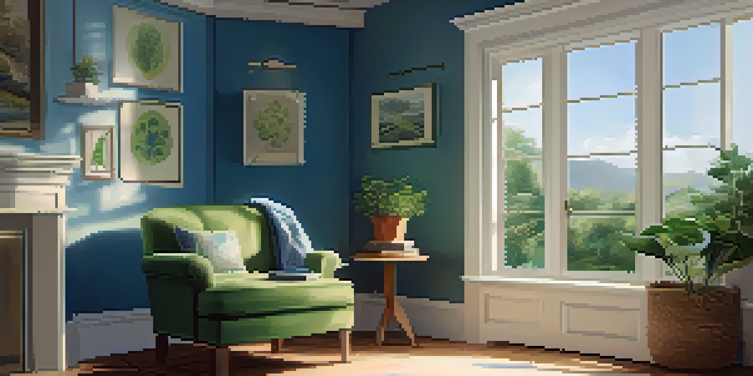
Imagine walking into a room painted in shades of blue and green; it can feel serene and calming. On the other hand, a room splashed with clashing colors might leave you feeling uneasy. This emotional response is why mastering color harmony is crucial for effective communication through design.
Ultimately, achieving color harmony can elevate your work, making it more engaging and memorable. Whether you're mixing paints or selecting colors for a website, knowing how to create harmony enhances your ability to connect with your audience.
The Color Wheel: Your Best Friend in Mixing Colors
The color wheel is a fundamental tool in understanding color harmony. It visually represents colors in a circular format, showing the relationships between primary, secondary, and tertiary colors. By using the color wheel, you can easily identify which colors complement or contrast with each other.
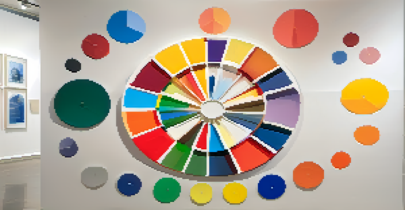
For example, primary colors like red, blue, and yellow can be mixed to create secondary colors like green, orange, and purple. This simple yet powerful tool helps streamline the color-mixing process, making it easier to visualize potential combinations and their effects.
Understanding Color Harmony Basics
Color harmony is crucial for creating visually appealing designs that evoke emotions and set the mood.
When you become familiar with the color wheel, it opens up new avenues for creativity. You’ll be able to experiment confidently, knowing which colors will harmonize beautifully and which might lead to disharmony.
Types of Color Harmony: Complementary and Analogous
There are several types of color harmony, but two of the most commonly used are complementary and analogous. Complementary colors are those that sit opposite each other on the color wheel, like blue and orange. When used together, they create a vibrant, high-contrast look that can really grab attention.
Colors, like features, follow the changes of the emotions.
On the other hand, analogous colors are located next to each other on the color wheel, such as blue, blue-green, and green. This combination tends to be more harmonious and soothing, making it perfect for creating cohesive designs that flow well.
Understanding these two types of color harmony can guide your decision-making process. Whether you aim for a bold statement or a gentle blend, knowing how to use these combinations effectively is key.
Triadic Color Harmony: A Balanced Approach
Triadic color harmony involves using three colors that are evenly spaced around the color wheel. This method creates a vibrant and balanced palette that can be both dynamic and harmonious. For example, the primary colors red, yellow, and blue form a triadic scheme that is visually striking yet well-balanced.
Using triadic colors allows for more creativity while maintaining a sense of order. By choosing one dominant color and using the others as accents, you can create depth and interest in your design without overwhelming the viewer.
Using the Color Wheel Effectively
The color wheel helps identify complementary and contrasting colors, enhancing your ability to mix and match successfully.
This approach is especially popular in graphic design and art, as it encourages a playful interaction between colors. Embracing triadic harmony can lead to stunning results that are both energetic and pleasing to the eye.
The Role of Warm and Cool Colors in Harmony
Colors are often categorized as warm or cool, and understanding this distinction can enhance your color harmony efforts. Warm colors, like reds and yellows, evoke energy and excitement, while cool colors, such as blues and greens, tend to be calming and serene. Knowing how to balance these two types can significantly impact the mood of your work.
For instance, a design dominated by warm colors can feel inviting and lively, perfect for a restaurant or social space. Conversely, incorporating cool colors can create a tranquil environment suitable for a spa or retreat.
By thoughtfully mixing warm and cool colors, you can achieve a harmonious balance that resonates emotionally with your audience. This delicate interplay can elevate your designs from ordinary to extraordinary.
Experimenting with Color Harmony: Tips and Techniques
Experimentation is key when it comes to understanding and applying color harmony. Start by creating small color swatches or using software that allows you to play with different combinations. This hands-on practice will give you a better understanding of how colors interact and can lead to surprising discoveries.
Another effective technique is to observe nature. The way colors blend in a sunset, a flower garden, or a forest can provide inspiration and insights into harmonious combinations. Nature often showcases perfect examples of color harmony that you can mimic in your own work.
Experimenting with Color Techniques
Hands-on experimentation and observing nature can lead to surprising discoveries in achieving harmonious color combinations.
Don’t be afraid to take risks! Sometimes the most beautiful color harmonies come from unexpected pairings. Keep a sketchbook or digital file of your experiments, and over time, you'll develop a personal color palette that resonates with your style.
Conclusion: Mastering Color Harmony for Impactful Design
Mastering color harmony is an essential skill for anyone involved in visual design, whether you're an artist, designer, or hobbyist. By understanding the principles of color mixing and the relationships between colors, you can create work that is not only visually appealing but also emotionally resonant.
From utilizing the color wheel to experimenting with warm and cool tones, there are countless ways to enhance your understanding of color harmony. Each project offers an opportunity to explore new combinations and techniques, so don't hesitate to dive in.

As you continue to develop your skills, you'll find that color harmony becomes second nature, allowing you to create impactful designs that capture attention and communicate effectively. Embrace the art of mixing colors, and watch your creativity flourish.