Understanding Color Theory: The Science Behind Painting Colors

What is Color Theory and Why Does it Matter?
Color theory is the study of how colors interact and how they can be combined effectively. It's not just about aesthetics; understanding color can transform a painting from ordinary to extraordinary. By mastering color theory, artists can evoke emotions, create depth, and convey messages through their artwork.
Color is the keyboard, the eyes are the harmonies, the soul is the piano with many strings.
Imagine walking into a room painted in vibrant reds and yellows versus one draped in soft blues and greens. Each space can evoke different feelings and moods, thanks to the careful application of color theory. This knowledge enables artists to make deliberate choices that resonate with viewers on an emotional level.
Whether you’re a seasoned artist or a beginner with a paintbrush, grasping the basics of color theory is a crucial step in your artistic journey. It opens up a world of possibilities, allowing for more expressive and impactful artwork.
The Color Wheel: Your Guide to Understanding Colors
The color wheel is a fundamental tool in color theory, showcasing the relationships between colors. It typically features primary colors—red, blue, and yellow—along with secondary colors derived from mixing them, like green and orange. This visual representation helps artists see how colors interact, creating harmony or contrast.
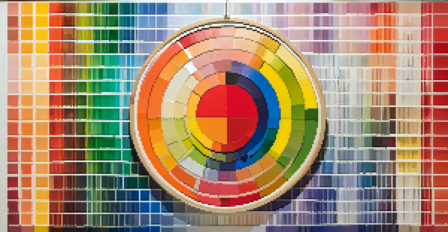
Picture the color wheel as a map for your artistic journey. It guides you in choosing color combinations that either complement or contrast each other. For example, pairing complementary colors like blue and orange can create vibrant tension, while analogous colors like blue and green offer a soothing effect.
Color Wheel Guides Compositions
The color wheel helps artists choose harmonious or contrasting color combinations for balanced artwork.
By understanding the color wheel, you can make informed decisions in your paintings, leading to more balanced and visually appealing compositions. It’s like having a secret recipe for creating harmony in your artwork.
Primary, Secondary, and Tertiary Colors Explained
At the heart of the color wheel lie the primary colors: red, blue, and yellow. These are the building blocks of all other colors and cannot be created by mixing other hues. Understanding primary colors is essential, as they lay the groundwork for everything else in color theory.
Colors are the smiles of nature.
When you mix primary colors, you get secondary colors—green, orange, and purple. These hues expand your palette and provide more options for creating depth and interest in your paintings. Tertiary colors, formed by mixing primary and secondary colors, further enrich your artistic choices.
Having a solid grasp of these color categories allows you to experiment fearlessly. As you mix and match, you can discover new shades and tones that make your artwork uniquely yours.
Warm vs. Cool Colors: The Emotional Impact of Hues
Colors can be categorized as warm or cool, each evoking different emotions and atmospheres. Warm colors, like reds, oranges, and yellows, tend to create feelings of excitement, energy, and warmth. In contrast, cool colors such as blues, greens, and purples often evoke calmness, serenity, and tranquility.
Think of a sunset painting filled with warm reds and oranges that radiates warmth and passion. Now imagine a serene landscape featuring cool blues and greens that invites relaxation. Each color palette tells a story and sets a mood, allowing you to connect with your audience on a deeper level.
Experimentation Builds Unique Style
Experimenting with colors allows artists to discover their unique style and express their creativity.
By strategically using warm and cool colors in your artwork, you can manipulate emotions and guide the viewer's experience. This balance between warmth and coolness can make your paintings not only visually striking but also emotionally resonant.
Color Harmony: Creating Balance in Your Artwork
Color harmony refers to the pleasing arrangement of colors in a composition. When colors work well together, they create a sense of balance and unity, making the artwork more enjoyable to look at. There are various principles of color harmony, including complementary, analogous, and triadic schemes, each offering a different visual effect.
For instance, an analogous color scheme uses colors that are next to each other on the color wheel, such as yellow, yellow-green, and green. This creates a serene and comfortable feeling in the painting. On the other hand, a complementary color scheme, like blue and orange, adds vibrancy and energy through contrast.
Understanding these harmony principles allows you to create visually stunning artwork that captures attention and communicates effectively. It’s an essential tool for artists looking to elevate their work and engage their audience.
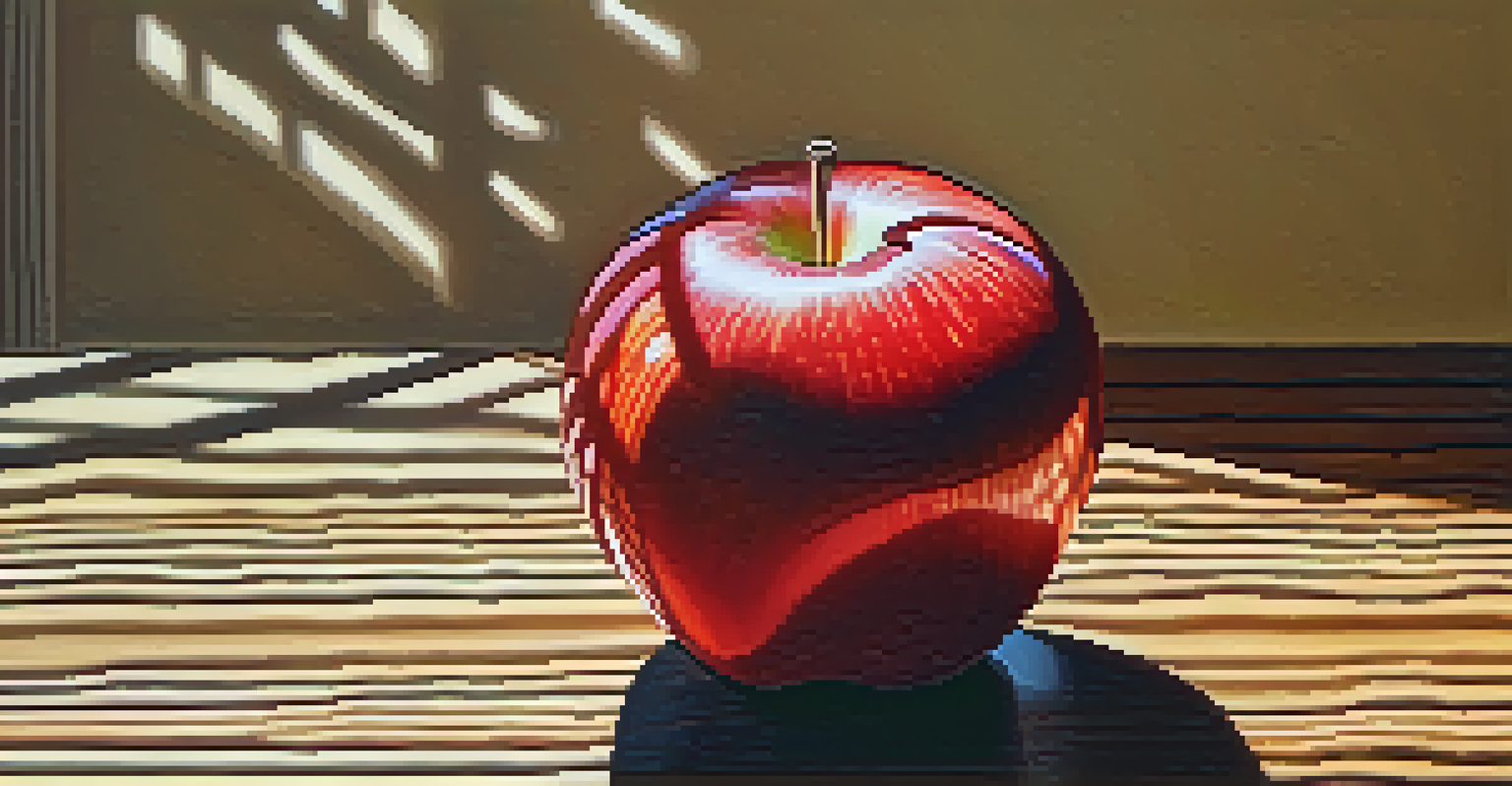
The Role of Light and Shadow in Color Perception
Light and shadow play a pivotal role in how colors are perceived in painting. Natural and artificial light can dramatically alter the appearance of colors, making them appear brighter, darker, or even change their hue. This is why understanding lighting conditions is crucial for artists when selecting and applying colors.
Consider how a vibrant red apple looks under bright sunlight compared to dim indoor light. The way light interacts with the apple’s surface affects how we perceive its color. By observing these changes, artists can create more realistic and dynamic representations in their artwork.
Understanding Color Theory Matters
Mastering color theory enables artists to evoke emotions and create impactful artwork.
Incorporating light and shadow effectively can add depth and dimension to your paintings. By mastering this interplay, you can bring your subjects to life and enhance the overall impact of your artwork.
Experimenting with Color: Finding Your Unique Style
Understanding color theory is just the beginning; the real magic happens when you start experimenting. Every artist has a unique style, and playing with colors can help you discover yours. Don’t be afraid to mix colors in unconventional ways or step outside the traditional color wheel.
For example, you might find that a splash of an unexpected color can breathe new life into your painting. This experimentation can lead to exciting discoveries and innovations, allowing your personality and voice to shine through your work. Remember, art is as much about exploration as it is about technique.
As you experiment with color, keep a journal to document your findings. Reflecting on your experiences can help you refine your style and make more confident choices in your future artworks. Embrace the process, and let your creativity flourish!